Showing posts with label inspiration. Show all posts

19/02/2021

Journaling with Senses - DAY 3: Smell


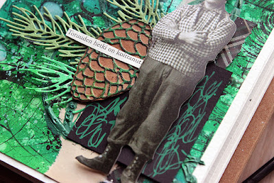
Heippati! It's Fri-yay of the third week of the month and that means third and final post for the new series of posts for the Seth Apter Creative Team. You can find Seth Apter's site here (link) and more about the Creative team here (link). I've included a list of products to the end of the post with links to Seth's own store.

This time I had two sources of inspiration or jumping off points to my projects - senses and Finland. In the course of the three posts I'm creating a piece inspired by a visual, an aural and an olfactory source. And as I'm hoping to keep a Facebook live this coming Sunday where I take you to a small tour around Helsinki, the other source for the pages is pieces connected to Finland. Hoping because of the weather - if it's raining cats and dogs, I'll postpone. If everything goes swell, the live will be on Sunday February 21st at 9 am EST / 3 pm CET on Seth Apter Creative Community (link). Please, follow my Instagram for updates! 

This post is the odd one of the three in a couple of ways. First of all about the sense I'm using. As you have probably used quite a lot of visual inspiration before and maybe aural as well, but I'm pretty sure that something olfactory isn't among the most used. But in fact, that's a powerful sense. People remember scents and smells better than photographs, for instance, and scents have the power to provoke memories if you suffer from dementia. Also, declining sense of smell is an early tell to dementia. 

I'm sure you all have had a situation where you have had a memory pop into your head because of a smell. And I'm also equally sure that you associate certain scents with certain places or people. As my goal was to use Finnish sources I chose a scent that first came to my mind when thinking about a scent to Finland. It was coniferous forest and spruce. Like I say in the video, maybe I should have gone with juniper as Finnish people are referred as "katajainen kansa" - folk of the juniper quality / out of juniper, meaning the resilience and sisu that we are connected to. Maybe one of the reasons for spruce was the Christmas tree we still had in the living room when I recorded the videos in the beginning of January. 

About 75 per cent of Finland's total land area is forest. The forests are present even in the big cities, well, our big cities, which aren't that big. But even here in the capital area you can get to an actual forest in just about 20 minutes bus ride from the city center. Keskuspuisto - the Central Park is a big forest area in the heart of Helsinki. Even though it's name in English refers to a groomed park, most of the parts I connect with Keskuspuisto are natural spruce and pine forest. There's some wider routes running through the area but also a myriad of smaller paths you can roam around. Sipoonkorpi National Park (18 km2) is just about 30 minutes drive away from the city center and bigger Nuuksio National Park (53 km2) on the other hand is less than an hour away. More about Keskuspuisto here in myHelsinki (link) and more about Finnish forests here in Visit Finland (link) and here in Metsähallitus (link). I thought one of the differences would be lack of links as well, but I ended up adding some. 


Another way this page differs from the previous two is the paper doll. As you have noticed, and I've said in the videos, I used a Tim Holtz paper doll as my focal point for each one. I carefully chose a doll to represent that theme. Where in the previous two the character has been a little girl, in this page I wanted "a lumberjack". The character echos, like I say in the video, my grandfather who was a carpenter. Also one of his sons, my father, is a carpenter by trade, so cutting trees and chopping them to planks is something I've seen since childhood. I can still remember when my husband and I were helping to move some logs from the tractor trailer and where him and me were useless to move one bigger one, my grandfather, then around 90 and with rheumatism, lifted the other end of the log with tricks and strength, so we could then got the lumber moved. I consider us really lucky as we have some wooden ladles and spatulas he has made still in use. 

Enough about the differences! One of the things that all of the three projects have in common as well is the stamp set. In a series like this, I like that there's something that binds the individual projects together. On top of the previously mentioned doll, tape and such I used PaperArtsy's Eclectica3 18 cling rubber stamp set in all of the makes. In the first one most of the markings are hidden underneath the paint layers, in the second one they are mixed among the blooms and in this one they are the most visible. That's got to do with the color combo that the scent brought to my head - green and black. It's something I might haven't otherwise used! I also chose the stamp patterns and stencils inspired by the scent.


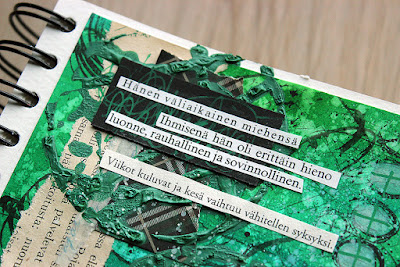
The journaling in the page is loosely translated: "Her temporary husband - As a human being he was really fine character, peaceful and amicable. Weeks go by and summer turns slowly into autumn. The moment of truth is at hand." As you might have noted, there's different fonts in the text as I had a couple of different books I cut the phrases from. The title - "her (or his, as again, Finnish doesn't have a gender) temporary husband" - caught my eye on a theater history book. It was a play from the 1930s, translated by Eero Boman, which is a funny coincidence. Boman was my great grandfather's surname before he changed it! 

Thank you so much for stopping by today! I hope you have enjoyed the series and picked up some inspiration! Please let me know if you have any questions! Stay safe and have a great weekend! Hopefully see you on Sunday! 


Materials: 

Ranger: Archival Ink Jet Black
Prima Marketing: Impasto acrylic paint Bottle Green
Prima Marketing: 3D Gloss Gel
Sizzix: Thinlits Pine Branch die set
Tim Holtz Paper Doll
green Posca paint marker
old book pages
plaid patterned cardstock
washi tape
green, kraft and black cardstock


18/02/2021

Journaling with Senses - DAY 2: Hearing


Moikka! It's Thursday of the third week of the month and that means second post for the new series of posts for the Seth Apter Creative Team. You can find Seth Apter's site here (link) and more about the Creative team here (link). I've included a list of products to the end of the post with links to Seth's own store.

This time I had two sources of inspiration or jumping off points to my projects - senses and Finland. In the course of the three posts I'm creating a piece inspired by a visual, an aural and an olfactory source. And as I'm hoping to keep a Facebook live this coming Sunday where I take you to a small tour around Helsinki, the other source for the pages is pieces connected to Finland. Hoping because of the weather - if it's raining cats and dogs, I'll postpone. But I'll keep you posted! 

Yesterday I started with sight and Helene Schjerfbeck (link) and today I continue to hearing and Sibelius. As I mentioned yesterday, one reason for using the senses as well, was that I was taking a trip down the memory lane and found out these older blog posts about inspiration. I wrote a whole series back in 2014 about different sources and ways to use them. Here's a link to the one about music (link).

I could have chosen from a variety of different Finnish composers and various styles. Even though we  in Finland have the most heavy metal bands per capita (about 53 per 100 000 residents), I went with classic and one of the biggest. One Finnish saying goes "sisu, sauna ja Sibelius" and I don't even have to translate that. Jean Sibelius has said to form the Finnish national identity and there's people who'd swap his "Finlandia" with "Mamme" by Pacius as the national anthem. I love "Finlandia" and it always makes me tear up, but it felt a bit too obvious and pompous for the musical piece to use as inpisration. "Valse Triste" is another favorite of mine, but I know too much of the back story to it, let's say. So I had a few options. I was immediately inspired by "Andante Festivo", but before deciding the song, I did some quick reading about the piece from Wikipedia (link). What I learned is that the maestro conducted a re-scored version of the original string quartet composition on air as a greeting to New York World Exhibition. Helsinki - New York connection! So it had to be this one! If you want to read more about Jean Sibelius, here's the Wikipedia link (link).

There's some controversy how the piece should be played. When Sibelius conducted the piece it was slower than most interpretations. I went with Sinfonia Lahti version as that Finnish symphony orchestra has specialized in Sibelius. I listened to a version from 2003, conducted by Osmo Vänskä, from Spotify. If you don't have Spotify, you can then check this 2010 version also by Sinfonia Lahti, but conducted by Jukka-Pekka Saraste from YouTube (link). The both versions are faster than the slower tempo Sibelius used himself.


Maybe you'll see a pattern emerging, finding those common elements I have in each page even though they are so different? I said yesterday that one is the process of first creating a sheet with mixed media that depicts the theme and repeat it in my video today. I also mention the washi tapes - the one I use in all three pages is from a Finnish company called Paper Garden, who design their own washi tapes after found old Finnish letters, wallpaper samples, receipts and other ephemera. I used one called "Aava" (link)

One more element that repeats in all of the three is the scribbles. In these first two I actually use the same paint marker to do them, too. I always use actual words when doing those markings so they look like words but as I alter my handwriting so much, you really can't make out the phrases and sentences. They bring more of a textural element to the page as well as something very personal.

What I forgot to mention in the video is that I thought about adding a stroke of black Izink pigment ink in the mix of the pastels when doing the watercolor -styled thing. That black would have represented the fact that "Andante Festivo" was played at Sibelius' funeral. But in the end, the little splashes of grey and black, which also added to the contrast, bring that idea forward in another way.


Last but not least, let me again provide the translation to the Finnish journaling. I felt that these three pages I just couldn't go with any other language than Finnish! Well, Swedish or Sami would have been fine, too, as they both are also official languages, but unfortunately I didn't have any old books in either. Swedish is our family's main language as three fourths of the family are Swedish speaking Finns - that is my husband and our daughters. 

The journaling on the page is loosely translated: "To be or not to be? Circus princess - her favorite pastime is to gaze upon the passing scenery while the train puffs forward and to think, plan, dream."

Thank you for stopping by today! Please be back tomorrow for the final post of the series! It's again a bit different take on the theme - and maybe not so many links! Stay safe everyone! 


Materials:
CChobby: Plus Color acrylic paint Peach
Prima Marketing: Impasto acrylic paint Boudoir Pink
AB Studio: Flower stamp
Ranger: Archival Ink Watering Can
Prima Marketing: Watercolor Pencils
Prima Marketing: Gothic Book clear stamp
Tim Holtz Paper Doll 
white Posca paint marker
CChobby: Plus Color acrylic paint Rain Grey
old book pages
washi tapes
white embossing powder


17/02/2021

Journaling with Senses - DAY 1: Sight


Hello again! It's the third week of the month and that means another set of posts for the Seth Apter Creative Team. As before, I'm starting today on Wednesday and continuing through Thursday to Friday. You can find Seth Apter's site here (link) and more about the Creative team here (link). I've included a list of products to the end of the post with links to Seth's own store.

This time I had two sources of inspiration or jumping off points to my projects - senses and Finland. In the course of the three posts I'm creating a piece inspired by a visual, an aural and an olfactory source. And as I'm hoping to keep a Facebook live this coming Sunday where I take you to a small tour around Helsinki, the other source for the pages is pieces connected to Finland. Hoping because of the weather - if it's raining cats and dogs, I'll postpone. But I'll keep you posted! 

In this first post I go with maybe the easiest sense - sight. I chose one of my favorite Finnish painters as my source of inspiration, Helene Schjerfbeck. If you want to learn more about her, here's a link to her Wikipedia post (link). If you on the other hand want more inspiration from her, here's a couple of links to older blog posts about an online workshop with Artful Academy, where I used her art as my inspiration source as well and tried to capture her style. First a portrait version (link) and a still-life version (link).

I mention in the video that I'll share links to the paintings so you can see my source. First, here's a link to WikiArt where you can see some of Helene Schjerfbeck's works (link) to see her overall style. I used mainly four works as my inspiration - links in the following go to different articles or Finnish National Gallery. Let me open up my inspiration a little.

"Female Profile", 1884 (link) is an early piece by Schjerfbeck. She was born 1862 and started at Finnish Art Society School of Drawing at 1873, at the age of 11. The 1884 painting is closer to the French-influenced realism than her later works, but I'm drawn to those textural brush strokes in the background. I tried to capture some of that texture in my paint work as well. Oh, by the way, you need to scroll down the Finnish page to see the piece - the link takes you to a bulletin about the two paintings by Schjerfeck in the collection of Ostrobothnian Museum travelling to London for exhibition. 

The style in "Self-Portrait", 1912 (link) is totally different. To me, this is true Schjerfbeck. Plain areas of color, stylized, minimalistic and yet so strong in emotion and expression. The cool grey and yellow ochre colors in the background inspired me to pick the blue and golden beige as my colors. There's also something wonderfully soft or hazy in her use of color, which I tried to mimic with my paint layer with Texture Powder. I also were inspired by those charcoal or pencil like lines around the face. 

And then two works that have the same name which show her artistic style development perfectly, "Dancing Shoes" from 1882 (link) where she's still finding her style and which is more realistic than the "Dancing Shoes" from 1938 (link). Yes, there's also difference in the technique as the other is a painting and other a litograph, but the latter mimics her painting style as well. I prefer the later version, I just love her stylized, minimalistic paintings. They are so spot on depicting the character and full of expression and emotion. As the girl in both has similar clothing - white dress, white shoes and black stockings - I could have used either one as my inspiration for coloring the paper doll in my finished page. 

One reason for using the senses as well was that I was taking a trip down the memory lane and found out these older blog posts about inspiration. I wrote a whole series back in 2014 about different sources and ways to use them. Here's a link to the one about paintings (link).


As you could see from the video, I started by making a mixed media sheet and then cut a piece out of it to form the background of my page. I thought it would be fun to have some similarities in all three projects even though I use totally different mediums and techniques - one of those similarities is the process of first creating a sheet and then moving a piece of it in my art journal. 


I promised in the video to have a translation of the Finnish journaling in my blog post. The journaling in the page is loosely translated: "It was pleasant for her to think that she could be traveling anywhere and be anyone. An adventure to the unknown had always fascinated her. But one must strive forward. From this day, there will not be any secrets between us." I translated the text to be about a woman, as I thought about the little girl in the page, but the Finnish language doesn't have a gender so it could be from a man, too. It can be the little girl's thoughts or then maybe thoughts of her father, a promise to not hide anything from her.

Thank you so much for stopping by today! I hope you have found this post interesting! Please be back tomorrow for another sense and another source! Enjoy your day!


Materials: 

Ranger: Archival Ink Jet Black
Prima Marketing: Texture Powder
Prima Marketing: Modeling Paste
Prima Marketing: Soft Matte Gel
Tim Holtz Paper Doll 
Ranger: Archival Ink Watering Can
alcohol markers
white Posca paint marker
old receipt 
washi tapes
white embossing powder
black carsdstock
script patterned embossing folder
soft pencil
old book pages


17/11/2018

Take your first step - Art Daily Cafe


Hi there! I was so honored to be asked to be a small part of the Art Daily project! Not familiar with Art Daily yet? You can read more about it here (link).

For this first project I started to think the theme of doors and gateways in a couple of ways. As this is my first project for this project, I wanted it to be a gateway of some sort.


First I thought about doing the cover of the album but then came to think something else completely. As the project is about creating daily, a big project like an altered cover may not be the thing. Also, if you are just starting the journey of creating or want to take a part of something new, you might not have a huge stash of different mediums. And creating something for yourself shouldn’t be about the mediums! They do make me happy, but if you are new to the game, you might not have gesso and gel medium, but what you do have is the burning desire to do something, create and try things out. And what you probably have is paper and a pencil. 

So, my project is a gateway also to creating. A gateway away from the thought that you need to have a lot of supplies in order to make something. This page may not be the most beautiful one, but you can easily replicate it and take in further. It’s a gateway to get you started.


What I did here is a collection of rubbings or frottages. I took some paper and a soft pencil with me when I left for work and stopped here and there to rub the texture of the bark, the pavement, the gutter into the paper using the pencil. I soon realized that the built textures with geometrical patterns seemed to be more intriguing than the natural, loose ones. With this technique you can create an endless supply of patterns and be inspired by the textures in different ways.

When I then got home, I cut and tore the pieces of frottage papers into smaller pieces and used a plain paper glue to attach them to the page. No fancy mediums, just something you probably have at home. Like I said, a gateway to creating. You can even create a rubbing each day, just explore the textures! After I’d adhere the pieces to the page, I then sketched a quick doorway on top using the same pencil I had used in the rubbing. You can still see some of the textures there, but other are hidden. Also, maybe a gateway to not being afraid to cover things up with something else? I then finished the page with some lovely washi tape and text stickers.


I also thought about the doors opening and closing and while I was creating the doorway, drawing it, I had some appropriate music playing. For once it wasn’t Turisas, my favorite band, but something else from Finland. I listened to “Valse Triste” from Jean Sibelius. It has completely different doors in it.

The piece was first composed to a play called “Kuolema” (Death) but then re-written later. You can read the background story in Wikipedia (link) if you like, but maybe rather first listen it without the background and see what you hear? Following the same theme, if you like more visual keys, maybe try out googling a Finnish painter Hugo Simberg and maybe a small painting called “Kuoleman puutarha” (Garden of Death). 


So, my first project is not heavy on mixed media, but that wasn’t my goal either. It’s a way to make a habit, to establish a new routine, also for myself. To take that five or ten minutes a day and create something for no particular reason. Or maybe for the best reason of them all - just because it makes me happy! 

Thank you for stopping by today! Happy Saturday! 


Materials: Prima Marketing


10/11/2018

Reflecting Egersund


Hi there and sweet weekend! How are you today? This post has A LOT of projects in it and it's also a trip down the memory lane as I'm sharing pages I did during Louise Nelson workshops at Egersund last month. 

The whole event was amazing! I loved meeting everyone, visiting beautiful Egersund again and especially learning from Louise. I also really loved how all of the three workshops were linked and formed a wholeness. It was wonderful to see the organizers Brit and Linda again and also others who attended the workshops like Linda, Elina, Arnlaug and Katja. It was also wonderful to see Egersund again. Like last time I was there - every time we had a little break, I went for a quick walk. It's so beautiful in there!


During the workshops we did monoprinting, carved stamps and drew portraits. I enjoyed every minute of it! I loved the phase of the workshops and how we could explore things on our own as well. I liked doing the monoprinting but I liked even more the stamp carving! It's highly addictive! 

Underneath you can see some of the stamps I carved during the workshop and you can see them in use in the layouts along this post. For example in the layout above there's the flower in use as well as the lines and in the following layout, after the stamp photo, there's the raven and the "stitch" in use. Luckily I still have some of the stamp rubber left so I can do other stamps when I get the chance. 


The first layout in this post is about a letter home. While writing this, I noticed that I forgot to alter the letters of the title with a white pen! Oops. But the topic is how we sent a postcard home while in London and the girls wrote it. There's a monoprinted background in that one from the workshops. 

The next one also has a monoprinted background along with some stamping. The topic is sweet Tania, whom I've had the pleasure of meeting a couple of times and really looking forward seeing again at Creative World! 

The one below is a special one for me. There's a background I did during the workshop and the crow stamp I carved. I used a line from the lyrics of "Chosen" as my journaling - take a leap of faith if you want to find out. 


The last two layouts have again monoprinted background and some stamping as well. The first one, the one underneath here is made for Miranda who at the moment of the workshops had just lost her house and everything in the hurricane. She's so sweet and lovely, I just had to do a page for her as I was worried about her well being while I was in Egersund.

The last but not least is a page I did of my two girls. The photo is taken while we visited Ateneum, Finnish National Gallery as they had Duckburg versions of the famous Finnish paintings in there. They also had a replica of Donald Duck's car in there where kids could sit. Naturally I needed a snap shot of that and then turn that into a layout. The red details in the page are inspired by the color of the car with the register plate 313. 

Thank you for stopping by today! Wishing you a wonderful weekend! 


Materials: Prima Marketing, 7 Dots Studio, A Flair for Buttons, Wow Embossing Powder


10/07/2018

Inspired By... Vol 7/2018


This "Inspired By" is a bit special one for me. As you may have noticed, my blog has been quiet for some time. It's because some time ago, first my right hand, then my left one stopped working. Or they worked but everything caused pain. It was a bit scary sensation, but now the situation is much better with physio therapy.

As the situation is now better, I want to start blogging again as I have many projects to share. I thought 10th of the month, the "Inspired By" would be a good start. Naturally that post includes a lot more writing than my normal post, but I wanted to test how my hands work, are we getting back to normal. But what this hand situation caused is that this post is a bit different than other "Inspired By" posts. Even though we are doing things a bit differently than before, I always try to create something for the post. This time my hands didn't allow that, but I wanted to share what I WOULD have created if I would have had the possibility.

A bit differently, I wrote. Do you remember, what that means? Inspired By is something sweet Marsha and me have been doing for years now. Until 2018 it was that we chose a subject to be inspired by and then did something inspired by that theme, a piece of art or a book. The inspiration could be anything but we both turned that into some kind of project and blogged the creation on the 10th. You can browse the past "Inspired By" posts from here (link)Inspired By is a playground, a concept we can use to explore, to play and to discover. We can do as much or as little we want and have time for. I guess it's not a surprise then that we both enjoy Inspired By very much but after doing it the same way so many years, we thought to change the things a bit.

This year, 2018, we both just post on the 10th with some source of inspiration we found that month. Or rather on a period from the 10th of previous month to 9th of the current month. It can be a series of photos, a book we read, an artwork we saw, just a pebble on the street or a new product we bought. We can make something using that source, but it's more about sharing just the inspiration. Consider it as a window to our creative minds!


Last month my older daughter attended a birthday party at Arkki - A school of Architecture for Children and Youth (link). She liked the party very much. Arkki in Helsinki, where the party was held, is situated in a place called Cable Factory. It's an old factory (where they made, surprise, surprise, cables!) and nowadays the place is filled with culture. The facility houses three museums, 11 galleries, dance theaters, art schools and there's several work spaces for different artists, for example. You can read more about Cable Factory here (link).

While my older daughter was at the party, the rest of us were exploring what this culture space had to offer. We naturally dropped the party goer to Arkki, then went to Theater Museum (link) - which is on the same space as The Finnish Museum of Photography (link). We also kind of stumbled upon one of the galleries with many interesting works of art.

When we were exploring, I immediately thought that this was it - that would be the IB for this month. I took some pictures, too, but after finding some interesting things at the Theater and Photography museum shop, I thought to use the ephemera. I also picked up a brochure of Arkki (above). What I loved about it was the whimsical city, colors and especially how the front of the brochure was shaped to form a city with layers and sort of perspective. The brochure somehow reminded me about Azoline's work. Before totally burying the idea of making something, I thought to paint with my toes using acrylics and then continue with felt pens to create a whimsical city of my own with the same kind of folded layers.


I'm also a sucker for old photos. I love their color, I adore the black and white photography, and I would love to know the stories behind them. I bought the post card in the middle above from the museum shop but found a total treasure for free. The paperback book was free of charge and while the topic (workers' theater in Helsinki) wasn't that interesting, the photos inside were and are pure gold. Just look at those make ups! Most of the photos are from actors in their stage attire, but there's also a couple from the audience. I can't wait to use these in projects! And if these aren't enough, there's more! The last little piece in the photo above is a little note telling about free pictures the museum offers in the net.


I found these very inspiring, but the gallery we visited was pure eye candy and hold enough inspiration for several "Inspired By" posts. I was really happy to find calling cards from all the artists that really caught my eye in the show. 

Rasaliina Seppälä (link) really inspired me with her choise of colors, the textures, the collage effect and the splashes. The works were like poetry in pictorial form. 

There were really beautiful paintings by Terhi Leppäkoski (link) in the show. I really enjoyed especially the bird paintings she had on display with great, textural feel, but there were also really stunning horse pieces. The color schemes of the works as well as the hint of humor really inspired me. I also came to think about the superb works Linda Brun creates. 

What I found most intriguing about the works of Meri-Kaarina Rahkomaa (link), were her use of plywood. I also found her imagery beautiful and loved how she had added folklore to the works. Somehow they rang a bell, hit a spot so to say.

I wasn't so keen on the paintings by Elizabeth San Miguel (link) but I really loved her altered books. Especially one with nails on it really shook me and spoke to me as a piece of art. 

So as you can see, there was a lot of inspiration to be found last month, but unfortunately I couldn't use it this time to make something concrete. But I can draw inspiration from this to new pieces and crafts. 

Thank you for stopping by today! Sorry for the long absence again! But now, let's see what's Marsha has been up to last month! Here's a direct link to her post (link)

10/05/2018

Inspired By... Vol 5/2018


Today is again the 10th and a new post in the "Inspired By"  series! I really struggled with this time, maybe because I really liked the piece I did last month or maybe because I was so excited about the topic I chose but then came overwhelmed...

Do you remember, that this year we are doing "Inspired By" a bit differently than before? "Inspired By" is something crazy talented and inspirational Marsha and me have been doing for years now. Until 2018 it was that we chose a subject to be inspired by and then did something inspired by that theme, a piece of art or a book. The inspiration could be anything but we both turned that into some kind of project and blogged the creation on the 10th. You can browse the past "Inspired By" posts from here (link).

Inspired By is a playground, a concept we can use to explore, to play and to discover. We can do as much or as little we want and have time for. I guess it's not a surprise then that we both enjoy "Inspired By" very much but after doing it the same way so many years, we thought to change the things a bit.

This year, 2018, we both just post on the 10th with some source of inspiration we found that month. Or rather on a period from the 10th of previous month to 9th of the current month. It can be a series of photos, a book we read, an artwork we saw, just a pebble on the street or a new product we bought. We can make something using that source, but it's more about sharing just the inspiration. Consider it as a window to our creative minds!


I had one main source of inspiration this month and another on the side. The main inspiration came from the season and the change of eating habits. Yes, you read right, eating habits. I always try to make sure that at least half of the plate is "greens" when we make food. My husband is more the kind "one tomato is enough" but I always try to think new vegetables, berries or fruits to accompany the main dish. Kids especially love blueberries and I like zucchini for example. 

Each spring I start to crave even more and more greens and lighter food so the amount of vegetables just increases. And they are of such pretty colors, too! They also make me think about a scene in "Girl with a Pearl Earring" where Griet arranges the vegetables by color when chopping them for food. Other place I found vegetables, too, was work. We received some new collections of kids clothes to work sometime ago. Mini Rodini has a pattern called "veggie", which you can see here (link) and Molo Kids also has a pattern titled "eat your greens" (link)


So with all these veggies around, I chose vegetables as my source. But the same thing happened as so many times before when I choose to go with a too broad of a source for inspiration. I had gazillion ideas and none. I thought about making dimensional little vegetable sculptures (kind of like the bunny I did for an earlier "Inspired By"), about a doll with the theme, about handmade paper with veggies... Then I set my mind on the colors and more over to colorants. I decided to use vegetables as my colorants and dye...well, that caused another problem - what to dye. To dye fabric or paper or... I thought about fabric first and doing another piece like I did last month, but then it seemed a bit dull - like I would repeat the same thing each month. Then I thought about the vegetable portraits of Giuseppe Arcimboldo (link), but realized in a heart beat that my skill level was too far to even attempt that. So I decided on paper instead.

Paper naturally caused a problem of its own. I knew I needed to make the color bath hot or even boil the paper so the paper need to be sturdy and not turn into pulp right away. I decided to go with something else than pure paper and bought a huge sheet of watercolor paper that has some fabric in it. It hold the boiling very well. 


Then I needed to gather colorants. I have a huge issue of using food in crafting. For example I dislike the macaroni crafts and wouldn't do those when my kids were little. Even printing with a potato is a bit questionable to me. Food is meant to be eaten, not to be played with. So I needed to think about if I actually could use food as a coloring medium, would that feel OK for me or should I continue searching. I decided it was OK to use parts that otherwise would have gone directly to bio waste, so I used peels and left overs instead of the real deal. This naturally then caused that I didn't get that much of the colorant and could only dye a small patch of paper. But as I didn't have the actual project in mind, this wasn't a problem and I was just experimenting.

I googled some colorants and went experimenting with others. The very first was beetroot, which was the best in the end. I boiled some beets for a dish I was making and gathered the boiling water and used that as a dye bath. For carrots I boiled some carrot peels. Artichoke I got from an old artichoke which would be thrown away by the shop but instead I got it, chopped it into pieces and boiled to get the color. If you want to see the colors I managed to get, please see a photo a bit further up!


After I had some papers once again a problem rose. What to do with those? The colors weren't that vibrant, the papers were more pastels than anything and some even had just a faint tint. First I thought to leave the project in that as this year it doesn't have to be a ready made piece, we can just experiment or even describe a thought process. But as I'm so thick headed and stubborn, I wanted to turn those pieces into something. Partly because I realized if I'm not doing it now, I will never do it.

The solution came from my other inspiration source. I went to a calligraphy workshop last month with a spectacular teacher, Marika Koskimäki-Ketelä (link). We tried different pens during the workshop but the topic was brush lettering. It was such a joy to take a part to a workshop instead of teaching one, even though I just love that, too. It was also so fun when we started with simple lines and I realized that I couldn't even draw a line - but after the workshop I managed to write a little something that didn't look too bad (link). So I wanted to add some handwritten pieces to the papers. As the paper pieces were really small, I then turned to the project I often use to experiment - ATCs.


I wrote a piece of paper with my normal handwriting, tore it apart and adhered it and the colored pieces to some kraft colored ATC bases using Soft Gel. I used a non-permanent pen while writing and got the wick out effect I was hoping to some of the pieces. In other places the ink didn't smudge at all and in some places it reacted a bit too much. 

For the focal point I created little vegetable pebbles. I painted some veggies with watercolors, then added Soft Gel under a Melange Pebble and then adhered it on top of the painted figure. After the gel had dried a bit, I then cut the excess paper off and adhered the shapes to my cards. To add a bit more texture to them I used Paper Texture Paste with a stencil, a piece of cord and some sewing thread in greens. I thought the Paper Texture Paste fitted the watercolor paper texture so well as it has a similar finish. 


Here's one of the cards on its own - the kraft cardstock background, beetroot colored piece of watercolor paper, written piece of paper and then an artichoke pebble on top. I've shot the picture on top of the worksheet I did during the calligraphy workshop. 

Like always, the cards are free for swaps or I can just send them out to persons willing. So if you'd like to have one, please send me an email! 


I wonder what Marsha has been inspired by this time! Here's a direct link to her post (link) but I highly you visit her blog and just browse through. She has such a talent to make out of the box projects and tutorials!

Thank you for stopping by today! And thank you if you managed to read the whole long post! Wishing you a lovely Ascension!  


Materials: Prima Marketing


10/04/2018

Inspired By... Vol 4/2018


Oh boy I'm excited about this "Inspired By"! I can honestly say that it's probably the best piece I've ever done so far! 

Do you remember, that this year we are doing it a bit differently than before? Inspired By is something sweet Marsha and me have been doing for years now. Until 2018 it was that we chose a subject to be inspired by and then did something inspired by that theme, a piece of art or a book. The inspiration could be anything but we both turned that into some kind of project and blogged the creation on the 10th. You can browse the past "Inspired By" posts from here (link).

Inspired By is a playground, a concept we can use to explore, to play and to discover. We can do as much or as little we want and have time for. I guess it's not a surprise then that we both enjoy Inspired By very much but after doing it the same way so many years, we thought to change the things a bit.

This year, 2018, we both just post on the 10th with some source of inspiration we found that month. Or rather on a period from the 10th of previous month to 9th of the current month. It can be a series of photos, a book we read, an artwork we saw, just a pebble on the street or a new product we bought. We can make something using that source, but it's more about sharing just the inspiration. Consider it as a window to our creative minds!


I have to be honest, I found this inspiration source early in the year. When I saw the first piece by Juliette Belmonte, I was mesmerized. She uses mixed media and the pieces remind me of my two favorite artists, Gustav Klimt and Alphonse Mucha. Still they are totally new, fresh and oh, so inspiring! At first I just was happy to be able to see the paintings and marvel them. But then a thought started to form in my head. Maybe I could try to do something like that? 

If you have followed me some time now, you maybe remember that I've done mixed media ladies before. But what stuck me in the works of Belmonte was, well naturally the talent, but also the use of fabrics and little ephemera in the base of the painting. As my goal this year is to add more textiles in my work, I thought having a go at her style would be perfect.


Belmonte uses oils in her work and even though I was tempted to try something I've never worked with before, I decided to go with acrylics. As I then started to do the piece, I grabbed another medium and found out that my art teacher was right! But more about that later. 

I put a rule for myself, too. I never draw profiles as I never get them to look right. So I usually draw faces from full front if I draw those. All my previous ladies have also been from front as well. So the rule was that this time I'm going to do a profile. So I grabbed my sketch book and started to practice. It took me by surprise how fast the hand started to do what I wanted, to remember how to sketch and draw! 


I even uploaded a sketch program to my mobile so I could sketch while going to work. I used it before I started to make my final piece, so maybe that helped, too. Although I must say that sketching using a finger as the pen wasn't easy! The line never formed there where I meant it to come! 

To challenge myself a bit more still, I wanted to go bigger than usual. As I normally love to work in a 6x6" or 6x4" canvas, this time I went for about 14x14". The background I used was an old advert piece done on a sturdy Kapa board. First I draw the outlines with a marker, adhered the materials, painted the board with white and black gesso and then started to add colors. 

My art teacher back in high school told me that pastel paintings are easy as I was marveling a piece in another school. I didn't think much of that then, as I thought the paintings were really beautiful and he was just making me feel better, but after coloring my lady with the Pan Pastels, I can state that maybe there was something in what he said. I started the coloring with acrylics and built the background layers using the paints. I also made some acrylic washes there to fade the layers a little. But what I used to contour the face was Pan Pastels. And boy that was SO MUCH easier than fiddling with acrylics! 


I enjoyed doing the profile so much and painting the shadows and thinking about the way the hair would flow and... This project was absolute a pure joy to make. I felt good making it and I feel good about the end result. The only thing now is that I'm not sure if I set the bar too high and if I make another attempt, it will end up ruined as I compare it to this one! 

I snapped some pictures along the process with my phone so I made a little collage underneath if you want to see. I guess the main reason for those was that after the third picture I started fearing I'll ruin the piece, lol. 


I knew from the beginning that I would include a dimensional part to her hair. I looked for the inspiration for that from Mucha's elaborate hairpieces and did my version of it. Just a little fascinator style piece, but anything bigger would have been too much. When I then had the piece adhered and colored, it seemed too detached from the rest of the project. So I sought help from Klimt and added geometric shapes underneath and then merged them to her flaming red hair. 

I really like how the final piece turned out! And what I like almost even more is the process and the feeling I got from it! Underneath you can see the finished piece. If you want to see the lady bigger, please click to the photo. 


I can see several "errors" now in the piece, but this time they don't bother me that much. What I'm maybe happiest about is the ear. I've developed a way to draw or sketch an ear, just a few lines to make the viewer think about an ear but in a piece like this that wouldn't naturally do. But after the first fear, I just started to add the shadows and light spots with Pan Pastel and ha, an ear started to emerge from the background. 

Let's see what I can come up for next month! I have to be honest, it's not easy for me to top this! I wonder what Marsha's been inspired by this time? Here's a direct link to her blog (link)!

What do you think about this piece? Should I give this style another go? 

Thank you for stopping by today! Wishing you a lovely, inspiring day!


Materials: Pan Pastel, Prima Marketing, Carabelle Studio, Lollipop Box Club


Related Posts Plugin for WordPress, Blogger...