Showing posts with label Nathalie Kalbach. Show all posts

14/10/2022

Sum of its parts - Nathalie's Creative Squad


Moikka! Today I'm sharing my project for the Nathalie's Creative Squad monthly theme “I am a collage”. If you look at the photo of the project, I’m fairly sure you don’t immediately recognize me from it. But I’m in there! It’s a kind of jigsaw “Where’s Wally”. You can see the original post here in Nathalie's blog (link).


Usually, when reading the month’s theme, my head starts spinning with all the possible ideas. But this time, funnily enough, I had a clear picture in my head from the start. I wanted to do a photo transfer and then hide it by cutting the surface apart. In a way going cubistic, but not quite.

Besides the photo transfer, I wanted to use other papers, too. As in my mind collage is a sum of various parts, acquired differently. Like some old book paper, a bit of painted paper and then maybe a cut out photo. Various sources, different textures. As this collage was about me, I wanted to add different aspects of me in a way. For example, like I say in the video, I stamped the “Queen Anne” house to the piece several times as home is important to me. Maybe I should have said “family” instead of “home” as it’s not that much about the building itself but more who are in it and what that building represents.

If you want to see how this quilt came into being, please see the video below!


When making the surface for the photo transfer, I added some of my handwriting in it. My mind drew a complete blank at that point, and I didn’t want to scribble a shopping list this time, so instead I used the first quote that popped in my head. Those were the opening words of Kalevala, Finnish national epic. The opening words in a way were appropriate in several ways – the theme of the phrases is about getting started, the speaker declares that he has an urge to begin the story, much like I was eager to get started or continue with the project. The other thing is that the words are in Finnish, my mother tongue, which bring my nationality to the piece. After all, that’s the culture I’ve grown up with and it’s rooted in me in ways I might not even come to realize.


Even though I had the idea of cutting the photo apart from the start, I needed some pondering when it came to the size and amount of the cuts. Cutting it into same sized squares seemed the easiest solution, although I first played with the idea of different sized rectangular bits. When I had the decision about the squares, it then came down to thinking about the size. Not to have the squares too tiny, I pondered between four and three centimeters, which meant three or four squares in a row. As you could see, I chose the bigger squares and three in a row as I thought that might be more pleasing to the eye.

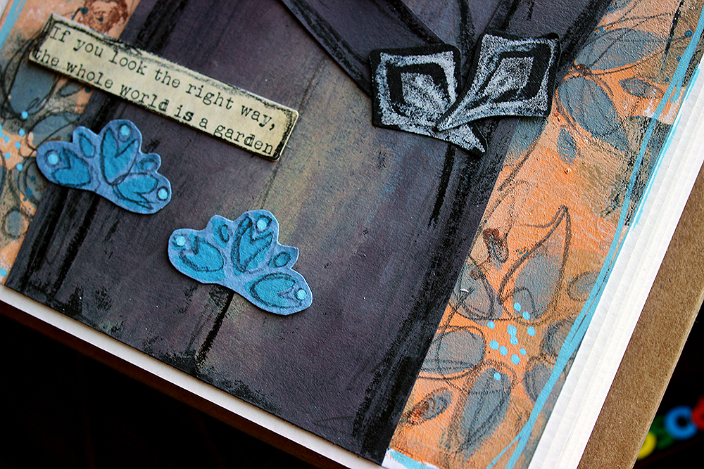
Throughout the project I also used a lot of “Love Knots” stamp. I love the graphical design of it, but also what it stands for – the combining, integrative force of love.

Thank you for stopping by today! Wishing you a lovely, love filled day and a great weekend!


Materials:

Queen Anne stamp
Love Knots stamp

Fabriano Accademia 160g cardstock
GelliArts: 5”x7” gel printing plate
PaperArtsy: Fresco Finish acrylic paint Aqua Duck Egg, Cerulean, Deep Sea, Vintage Lace
Ranger: Distress Collage Medium Matte
Ranger: Archival ink Jet Black
Ranger: Archival ink Paradise Teal
Fiskars: A4 SureCut paper cutter
Tim Holtz Idea-ology: Chitchat word stickers

a laser printed photo
a brayer
a pencil
old book pages
handwritten notes
double sided adhesive sheets


16/09/2022

The whole world is a garden - Nathalie's Creative Squad


Heippa! Today I'm sharing my take on the “Favourite art – my way” theme of Nathalie's Creative Squad. Like I say in the video, I again struggled a bit in the beginning. This time the trouble was to narrow down the options! If you want to see the original post, you can find it here (link) at Nathalie's blog.

Choosing a Finnish artist was a must for me. At first, I thought about a female artist, but didn’t want to go with Helene Schjerfbeck. For one, I wanted to highlight someone maybe not as known and secondly, I’ve already used her art to inspire me a couple of times. (project 1, project 2, project 3) My second choice was a lady, who’s photo is always on my craft table, Ellen Thesleff. I love her work, but none of the pieces really jumped up to me this time and was like “me, redo me!”. The reason for this might also be that I’ve used her art before as well (link). Back to the drawing board it was!


I then decided to take a totally different approach to the subject and let a tool to do the deciding for me. Like I say in the video, since I got the “Fairview Fan” foam stamp set, I’ve seen the other stamp as a skull. I have been eyeing it before, thinking about a Halloween card, but not yet jumped to the idea. So, now was the perfect time! After deciding the skull, it was then easy to pick up the artist and artwork.

Death, as a personification, is a re-occurring character in the works of Hugo Simberg. He’s not a scary character but more a bit lost and an outsider. In some ways he reminds be of the Death in the Discworld series, not quite getting the ways of men. My favorite piece with Simberg’s death character is a painting called “Kuoleman puutarha”. The subject was so dear to the artist himself that he did several versions of the piece. What I used as my reference here, is made in 1896, a small gouache and watercolor work. You can read more about the piece here (link) and about the artist here (link).


In the painting, there’s three death characters caring for the plants in their garden. While my favorite of the three is the one on the left, leaning to the workbench, watering the plants, I chose to make a version of the second character, the one in the center. He’s the one who usually gets pointed out as the posture of the character is so tender, almost fragile. My character doesn’t have the same fineness of the posture, but I hope the atmosphere still comes across!

If you’d like to see, how I made the page, please see the video below. If you want to jump directly to the making process and avoid the introduction, the process starts at 1:08.


What I used in my piece, besides the obvious character, was the warm honey toned color scheme. Like I said earlier, Hugo Simberg did several versions of the subject, but as they are mostly black and white, they are missing the warmth of the watercolor piece that inspired me. Another colored version of the “Kuoleman puutarha” is at Tampere Cathedral. The colors are a bit different in it as well, as it’s a fresco, painted to the cathedral wall.

While the original artwork has an abundance of strange plants, I depicted those in my take more uniformly. The background flowers represent the other plants in the garden, while I highlighted the bluebell-styled flora as it’s the one the character is holding.

I hope you don’t get frightened by this character but rather find him endearing! Thank you for stopping by today, have a great weekend!

Ps. For more bones, please join the Facebook live tomorrow! More about that here (link), in my Wednesday post.


Materials:

Fairview Fan foam stamp set
Love knots rubber stamp
Mesa Verde stencil
ATC Mixup stencil

GelliArts – Gel plate 5x7”
PaperArtsy – Fresco Finish acrylic paint Butternut, Gold Rush, Buff, Vintage Lacem Steel Grey, China
Ranger - Archival Ink Sepia
A.B.Studio – Pure collection, “Don’t Give Up” 12x12
A.B.Studio – Rustical Times die cut pack
Posca – PC-3M Light Blue

Black cardstock
Aquarelle pen white, black
Pencil


12/08/2022

Me be night owl - Nathalie's Creative Squad


Fri-yay! Today I'm sharing my Nathalie's Creative Squad project with you. You can see the original post in Nathalie's blog here (link).

The month’s theme this time was "Goodnight, art journal". Like I say in the process video, first I got a bit puzzled as not so long ago I did a nighttime inspired art journal page for the team. I say, “not so long”, but actually it was almost a year ago! Time does fly. You can see that page here (link).

Why I’m bringing this up was that I didn’t want to repeat myself! Although there’s similar elements in my page now, there’s also something new, so I call that mission accomplished! Because like I say in the earlier post, I would love to be a night owl. In everyday life my current work and family life don’t allow me to follow my natural rhythm, but if I had the possibility I’d work until midnight and then sleep in. I seem to have a new productive sequence in between 9-11 pm!


I first tried to think what to do, but then gave in and just started doing, going with the flow. And I really like how the page turned out! I first colored two strips of paper using gel printing, then added patterns on top using stencils and lastly a flurry of stars and a moon. Why two strips of paper, you might ask. Well, they just happened to be there when I was reaching out to get a background piece. I thought it would be fun to start with those, to use “left-overs”. If you want to see, how the page came into being, please see the video below!


As you could see from the video, I used two Nathalie’s stencils in my make. Why I chose these two? Well, the reason for the ATC Mixup is kind of obvious, I think. It’s because of the multitude of patterns in one stencil! I didn’t have to settle to just one or two patterns but could use an abundance! And as you can move the stencil and continue the pattern, the smaller size doesn’t matter, either. I did want to add another stencil to the mix, to have a bigger pattern. For that I chose “Manhattan”. Its angular design complimented the curvier, softer patterns of the ATC Mixup nicely.

I went through several Tim Holtz paper dolls when searching for the right one. This lady had the right air about her, and she somehow reminded me about Edith Södergran, a Finnish poet. One of the first poems I read from her was titled “Stars”. But when I was checking the placement, her white shirt looked too pale, and it had such a big contrast between the inky blue background it was stealing the attention too much. Luckily, I had an easy solution! You could see that from the video, too, I just added a pattern on top. To keep the project cohesive color-wise, I used one of the colors I had used in the background as well. The patterning hid some of the details of the garment, so I then drew those in. You can probably see my hesitation in the video. I was afraid that the black Posca marker might be too much, but luckily it was just what the doctor ordered! Her hair balances the dark marks nicely.

Thank you for stopping by today! Wishing you a splendid weekend! 


Materials:

StencilGirl Manhattan stencil
StencilGirl ATC Mixup Kalbach stencil

GelliArts 3x5" gel plate
PaperArtsy Fresco Finish acrylic paint Double Denim, Purple Wine, Midnight, Snowflake
Prima Marketing Metallique wax Old Silver
Posca PC-5M Coral pink
Posca PC-1M Black, Silver, White
Tim Holtz Idea-ology Chitchat stickers
Tim Holtz Idea-ology Portrait Paper Dolls
A small circle punch


15/07/2022

Fiery Love Triangle - Nathalie's Creative Squad


Moikka! Today I'm sharing my take on the “On Repeat” theme of Nathalie's Creative Squad. I chose a triangle as my shape and repeated it in my background as well as topic and focal points. Here's the link to the original post (link).


I was leaning towards circle, but I have used the “Groove Street” set so much that I wanted to do something else instead. So, I took a look at my foam stamps and the other shape that was present was the triangle in the form of the “Triple Play” stamp set. It was a perfect choice as that gave me a bunch of different patterns to play with, too!

I admire the gorgeous geometrical patterns that Nathalie does to her journals. So, my original idea was to mimic one by using different colors and patterns and layer the stamps. I started a pattern, but it didn’t look pleasing to my eye. And it also didn’t look “me”. So, I started over. Instead of building the background stamping to a piece of white cardstock, I started instead with some collaging. Even though the book pages I added to the sheet first can’t really be seen in the finished piece, I felt it was “my” way to go. Those old book page hues also played a role on the color palette of the page! If you want to see how the page came into being, please see the video below. I have to apologize, though, because the video is a bit fuzzy in the beginning. It does get sharper, promise!


As you could see from the video, the bold pattern in the background freaked me out! I guess it’s partly the red color as well as I seldom use that. But luckily there was a way to make it more subtle. It’s now like fire burning inside, hidden from the prying eyes – the strong reds and pinks underneath a beige surface.

While I could have chosen pyramids or juice boxes or even pizza slices as my topic with the triangle, the first thing that popped into my head was a love triangle. I blame Poirot for that! Or rather, Pamela Lyall as we had just watched (for the thousand time) “Triangle at Rhodes”. It’s an adaptation of the story by the same name, starring David Suchet, and is a part of the “Poirot” series. My husband and me grew up watching Poirot from TV, and nowadays we have the series in DVDs so we are watching them with our kids. In the episode in question Pamela Lyall states that human beings tend to reproduce certain stereotype patterns and draws a triangle in the sand. By the way, if you haven’t seen or read the story, I recommend it. It has a surprising twist, even when triangles are concerned.

Thank you for stopping by today! Wishing you a lovely day!


Materials:

Triple Play foam stamp set

Fabriano Accademia 160g
Prima Marketing: Art Basics Clear Gesso
Ranger: Archival Ink Sunflower, Vibrant Fuchia, Carnation Red, Potting Soil
Ranger: Distress Ink Vintage Photo
PaperArtsy: Fresco Finish acrylic paint Vintage Lace
Tim Holtz Idea-ology: Die-Cut Paperdolls Mini
Tim Holtz Idea-ology: Chit Chat word stickers
Posca acrylic marker PC-1M black
Fiskars paper trimmer and scissors
old book pages
heat tool
water mister
double sided tape
foam tape


17/06/2022

Linnea Borealis - Nathalie's Creative Squad


Hello there! It’s Riikka here today with my take on the Nathalie's Creative Squad monthly theme of “The Great Outdoors”. You can see the original post here (link).


While I did go outside to get some inspiration for my project, I stuck with my first idea when I started to think about outdoors in Finland. While we have over 150 000 lakes (if the small ones are calculated as well) and mainland has over 6 300 km of shoreline, I started immediately to think about the forests! And I’ve lived in coastal cities my whole life! But I recall Finland being called “the land of green gold” as well, meaning the vast area of forests that cover over 75% of the land. While the old Finnish films usually always depict birch trees, to me the old coniferous forests are the type that scream Finland. Those murky fir tree forest with lush green moss and thin lines of sunlight seeping through from the gaps in the thick canopy.

In such a forest you can find a delicate flower during the height of summer. In the dim lit forest floor, you see these little dots of the palest pink that seem to radiate in the dark like tiny stars. The flower was also Carl von Linné’s favourite, that’s why the plant carries his name - Linnaea Borealis. Linnaea is after his original last name, Linnaeus and ‘borealis’ meaning ‘northern’. The plant is found in the Northern parts of America, Asia, and Europe.


When I was roaming about in an old forest, looking for further inspiration, I came across some fir tree branches that were fallen to the ground as there had been strong winds the previous day. I picked some with me and ended up using them as a brush and as a patterning tool. They bring that forest aspect to my ATCs depicting the delicate flower.

Now I had my topic and some of the means to create it, but I was still pondering about HOW to create the flower. I ended up deciding to use one of the FAN-tastic stamps to make the flower but didn’t look them thoroughly through before I was making the cards. My original thought was to stamp the fan shape and twist it into a dimensional little cone, but I found something even better. When I then was choosing the stamp to be used for the delicate bell-shaped bloom, I couldn’t believe my eyes as I saw one in the stamps! I couldn’t have drawn or found a better way to depict the flower! The “Park Ave” stamp had a linnaea borealis in it! I’m happy that you can only see my hands in the video so you can’t see my stunned face!


As you could see from the video, I used the FAN-tastic stamps also for another purpose. I added some highly stylized fir trees to the background before adding the plants in place. I picked the “Van Vorst” stamp as it’s thin line patterning reminded me of fir tree needles.

Now you may ask if the flower is called linnaea borealis why my project is named Linnea. There are two reasons for that – first that I misspelled it and second, probably why I misspelled it in the first place, that one my other daughter’s names is Linnea, after her great grandmother. If you want to read more about the flower, here’s a link to Wikipedia (link).

Thank you for stopping by! Have a great time exploring the outdoors for inspiration! You never know what you may find!


Materials:

RubberMoon: FAN-tastic Small stamp set

PaperArtsy Fresco Finish acrylic paint Prawn, Midnight, Granny Smith, Cherry Blossom
Fabriano 160g cardstock
GelliArts 5x7 printing plate
Ranger Archival Ink Black Soot
Tacky Glue
Tim Holtz Idea-ology Metallic sticker book
Posca PC-1M white paint marker
Black India ink


13/05/2022

Those, who imagine - Nathalie's Creative Squad


Hello there! Today I'm sharing my monthly project for Nathalie's Creative Squad. You can see the original post here (link). This month the theme of the posts is colours, a pair of them actually. My current favourite was an easy task, but the other colour took me by surprise!


My “go-to” colour scheme is and has probably always been blues, teals, and turquoises. Those warmer blue tones, like summer sea. When I’m taking a class, I usually tend to use those colours as they are my safe zone. I used to dislike pink a lot but since my two girls were born, it started appearing to my projects and has stayed since then. Well, I did dress them in pale blue or other colours as babies, but when they were old enough to make their own choices, the colour started to please my eyes, too. Teals and turquoises are my usual “go-to”, like I said earlier, but lately I’ve been using more and more of a sapphire blue colour. Partly because of that, and partly to give myself a bit more challenge, I picked that as my current favourite.

When I was thinking about what colour I don’t use, I would have normally said bright red or yellow, but this year has been a bit strange as I’ve done projects using both! So, to see what colour I haven’t been using lately, I took to Instagram. By skimming through my profile, I realized that at least a yellow green, a lime colour was missing. So, I picked that for the other colour and like that I had my combo chosen!


I’m not actually totally sure how the idea of the pair of cards was born. Probably I was pondering what to do with the colour combo and foam stamps. But I actually draw a little sketch of the card for myself at some point. At that stage I was thinking of using an old button as the focal point, picked from my inherited stash, but when I then pulled the other materials to the work table, I realized I could make my own buttons!


This project was so much fun as I’d never have picked this colour combo otherwise! I did use quite a lot of white to make the end project airy as the colour combo is quite intensive. I also wanted to use the stamps on different surfaces, to bring extra interest to the project with just two colours, so that’s why I picked not only paper for this project but also white cotton fabric. For the buttons I used the shrink plastic as I could then use the foam stamp in two sizes in a way. If you want to see how I made the cards, please see the video below.


I had more materials made but ended up doing just two cards – kind of mirrored images of each other. The “left-overs” I then put to my stash and can use those later for a journal or another card project. So, don’t be surprised if you see a button like this in another project or a piece of that green and blue patterned piece I created as the first step! I often make more collage material than I use in the project I created it for. That makes creating another project then faster as I have the mixed media papers and embellishments already done!


As you could see from the video, I finished the cards with lines from an old book. This does bring a new color to the mix, but I thought it to be so neutral and such a small detail, that it’s ok. And it goes nicely to the warm green. I often do my projects in English, but I’ve been using more of my mother tongue lately. The other card reads “What’s the reason for this cause” or “Why such a goal” and the other “Those, who imagine”. I picked the latter also for the title of the video, because we all need to imagine to create.

Thank you for stopping by today! Wishing you a great weekend!


Materials:

ArtFoamies: Groove Street foam stamps
Fabriano 160 g cardstock
PaperArtsy: Infusions dye stain Emerald Isle, Golden Sands
GelliArts: gel printing plate 5x7”
Creative Company: Plus Color Navy Blue
PaperArtsy: Fresco Finish acrylic paint Key Lime
We R Memory Keepers: Crop-a-dile

White cotton
White cotton twine
Matte transparent shrink plastic
Pages from an old book
Heat tool
Water mister
Brayer
Tweezers
Scissors
Needle
Double sided tape
Foam tape
Craft glue
Acrylic stamping blocks


Materials: ArtFoamies, Fabriano, PaperArtsy, GelliArts, We R Memory Keepers, Sinelli


Related Posts Plugin for WordPress, Blogger...