30/06/2023

Sugar and spice and everything nice - A.B.Studio


Hi again! It's Friday and video time! This time it's a process video for A.B.Studio and I'm making a couple of cards. 

If I'd do something differently, now looking at the cards, I would leave the watercolor leaf out of it and just add the watercolor to the background, more like a splodge. As with the composition on top, you really can't tell it's a leaf anymore! But, oh well, it is what it is. I guess that just shows how I let the project lead me in a way - I felt like adding watercolor through a stencil and did it. If you want to see the process, you can see that from the video below.


As you could see, I was working on two cards with the same ingredients and idea. It's not often when I make just one card, but more often than not I work on a series of two, three cards or even bigger numbers if I'm making ATCs. I wonder why? Maybe it's got to do with the fact that I often use bigger pieces of paper anyway so "with the same trouble" of sorts I get a couple. 

What about you? Do you work with one card at a time or make a set whenever possible? Or does it depend on if the card has a certain recipient already or are you just making them to be used when needed? 

Thank you for stopping by today! Wishing you a great, sunny Friday and wonderful weekend! May it be a crafty one!


Materials from A.B.Studio:


Other:
Prima Marketing - Art Extravagance texture paste White Crackle
Prima Marketing - Watercolor Confetti set
Tsukineko - VersaMark ink pad
Ranger - White embossing powder
Korttipaja - Sanasuikalesetti #1
Pale blue, mid blue cardstock


28/06/2023

A Finnish graduate - a card


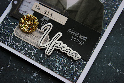
Moikka moi! Today I'm sharing a card I made for a relative, who passed the matriculation examination (that's the tests at the end of upper secondary studies). Usually when I'm making a card to a specific recipient I might be a bit scared, but this card was so fun to create. And what even better, the recipient really liked it! 

I had a clear vision from the start. I wanted to use a Tim Holtz paperdoll as the focal point and add the traditional Finnish student cap on him. I knew the stickers I had were too small but I thought that just to be funny and heighten the feel of the card. I also knew I wanted to create with a black and white color palette as the cap is in black and white with a golden lyre emblem in the front. 

The background is made with a P13 paper, which had the black and white color scheme and a nice floral pattern. On top I then added some gesso and I think I added some stamping, too, not that you can tell anymore. I then took a neutral colored strip, another Tim Holtz element, and added some of the small tickets to the side and sewed them to the background. On top I then layered a label, some tape, the portrait and then some other embellishments to hide the strict cut at the bottom of the portrait. My husband was looking for a paint for a piece of furniture and we ended up taking some paint samples home to compare. A piece of one of the swatches became a part of this card - "Nordic Noir". 

The last thing I added was the student cap, pushed back in a laid-back manner, then the golden lyre and also the text. The front says "Upeaa", which means great and on the inside I stamped "juhlapäivää", loosely translated a special day. The front kind of marvels the passing of the exams, but when you put the two together, it just celebrates the day. 

Thank you for stopping by today! Wishing you a wonderful day! 


Materials: P13, Tim Holtz, Prima Marketing, Sinelli, Korttipaja, A.B.Studio, Tikkurila


27/06/2023

Bird of wonder - a tag


Hi there everyone! It's the last week of June and soon July starts. Wow! Time is a fiddly thing - absolutely flying at times and crawling at the next moment. Having said that, time was flying when I created this little tag. It was one of those "want to do something quickly after a workday" moments. 

As I was kind of stealing a moment and wanted to be extra speedy, I went with my favorite color palette of blues. I used a left over piece I had from the cards I made earlier (link) and paired it with a strip from Tim Holtz Idea-ology pack. Both the background strip and the focal point are from the same strip, I just cut the bird part loose. I added some hand made paper, a piece of a newspaper and a cut out branch to make more layers. To add a couple more details, I attached some ring stickers, a piece of lace and a button. To finish the little lace and button combo, I also pushed a pin through the lace and paper.

Thank you for stopping by today! Wishing you a lovely week!


Materials: Tim Holtz Idea-ology, Ranger, A.B.Studio


23/06/2023

Midsummer sorcery - a canvas


Happy Midsummer Eve!

Remember this canvas (link)? Or maybe this one (link)? Yes, they both look almost the same and even have the same name. The latter link is to the workshop sample and the other to a version I made while teaching the workshop at Ikaalinen. I kept the same workshop in Turku as well, but this time I altered the look when I got home. 

As you can see, the composition is more or less the same than in the previous versions, but this time I changed the colors. During the workshop at Klemmarikellari I used the same patina color scheme as the two previous ones, but when at home I decided to alter the look a bit. I kept the patina look in the frame part but added more shine and sparkle to the middle by using a glitter paste and some metallic paints. The skull I painted with copper tone and then rubbed almost all of it off so the look is leathery or old bone. 

With this piece I want to wish you a merry Midsummer Eve! I thought this project fits the magical qualities of the celebration. At least here in Finland there's all sorts of spells and sorcery you can perform during this particular time. Like if you gather seven different flowers and go over seven fences in silence and then place the flowers under your pillow, you'll dream about your future partner. 

Thank you for stopping by today! Have a magical weekend! 


Materials: Sizzix, Prima Marketing, PaperArtsy


21/06/2023

Snarky school boys - a set of tags


Hiya! Today I have some snarky school boys for you. Or I'm not sure if these vintage portraits are of school boys but somehow especially combined with the snarky comments they started to feel like ones! 

I kept some workshops during the spring and one of the, which I kept twice, was a minialbum workshop. During that I never got to make the project myself as I was helping others, but I did always show how I started to treat the inner pages which were made out of tags. After the workshops I then had some colored tags in my stash. As I've been trying to use what I got and not just hoard stuff, I embellished the cards and turned into small card like thins. All it took was to add a vintage portrait on top and some stickers! ...well, to be honest I did add some crayon doodles and stamping in there as well, partly because I wanted to try out my new oil pastels! 

Thank you for stopping by today! Wishing you a lovely day!


Materials: PaperArtsy, Tim Holtz, Ranger


20/06/2023

Lost, not found - an assemblage


Hi there! Sunny days and ice cream - what could fit better to that than Halloween? I think it might have been the style of dress the lady is wearing that got me thinking Victorian times and then the goth in me woke up. Anyway, the end result is quite heavily Halloween or maybe even rather "Memento mori" influenced piece! 

The piece started with the background. I wanted to create a look of an old wall with patches of wallpaper torn. I embossed several pieces using a Sizzix embossing folder and adhered them to the background using a layer of modeling paste. I didn't go for a smooth surface, but rather bumpy one, trying to get a feeling of an old, weathered wall. After drying I then coated the whole thing with black gesso and then used Distress Oxide together with a colored wax to highlight the texture. I picked red because of the wallpaper in my husband's room when we started dating. He had this really peculiar 70s styled red flocked wallpaper. 


When I had the background done, it came to making the composition on top. At this point the cluster could have been anything, but I think it was the combination of the lady with the Victorian vibe together with the fact that I'd just bought the Idea-ology Halloween pack to steered me to this dark path. I used some die cut items to make the composition fuller and even added an old spoon there as a horizontal line. The last detail I added is that tiny playing cards. It's from a tiny deck that was all the craze during Easter time among crafters in Finland. A Finnish YouTuber had his own brand of Easter eggs and in one of them were a deck of tiny cards. I managed to get one and this is the first project I used a card to!

Thank you for stopping by today! Wishing you a bright day (even though the project might be a bit gloomy)!


Materials: Tim Holtz Idea-ology, Prima Marketing, Ranger, Sizzix


16/06/2023

Use what you got - a set of cards


Moikka moi! It's again Friday and time for a process video! This time it's a bit different in a couple of ways. First that I for once show the whole composition part and secondly it's about the products I'm using. Let me explain. 

Like I've said before, I have this drawer that I pop in every paper embellishment that was left over from a project. Like if I have cut several flowers loose from a 12x12 sheet and use just some or I have stamped some embellishment and use just some. I also put things that I receive in ATC swaps there and sometimes other loose embellishments. The drawer is a treasure trove, but I hardly ever use it! So, with this cards it was going to be different. I only made the backgrounds from new pieces of cardstock, but all the embellishments and layers came from the drawer. This means, more than ever, that each card is unique even though I was working on a series. 

As I said in the beginning, I left the whole composition part in this time. I hope it maybe shows a little insight to my process and mind. What I edited out was the choosing of the first stack of embellishments. I show the start though, so you get a little idea. I went through the whole stash using style, color, vibe as my first pick. I then went trough the first pick pile again and then started arranging items to the cards. But you can see that on the video below.


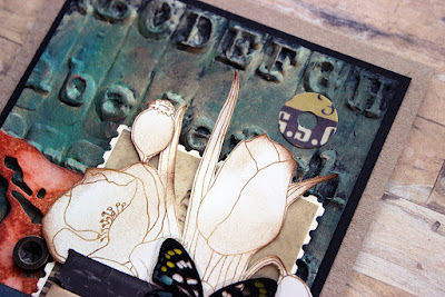
As you can see, each of the cards has a similar background. It's done on top of a piece of black cardstock embossed using an embossing folder. When choosing the elements on top of the card, I then kept the design in mind. As even though the elements all have something in common, there's some differences in choices between them. Like I wanted to use a typewriter in the card that had the typewriter background. And the gentleman seemed to go better on top of the grungy looking metal plates than the wallpaper looking design. Most of the choice were made unconsciously, though. But it's interesting trying to analyse your own process, try to see what causes those decisions! 

Thank you for stopping by today! Wishing you a fun Friday and great start to the weekend!


Materials for the backgrounds:

Sizzix - Textured Fades embossing folder Typewriter (664760), Damask (665733), Industrious (665754)
PaperArtsy - Fresco Finish acrylic paint Toad Hall, Deep Sea, Magic Moss
Ranger - Distress Paint Tarnished Brass
black cardstock

Other: 
gifted ephemera, bits from A.B.Studio papers, die cuts using Sizzix dies, 7 Dots Studio die cuts, Finnabair metal embellishments
Ranger - Distress Ink Vintage Photo
black cardstock
kraft cardstock


Related Posts Plugin for WordPress, Blogger...