Hi there! Today i'm sharing a layout I did for A Flair for Buttons with you. This page is done about my younger daughter who adored mohawks a while back. Now she's actually growing her hair to have it long, but as you can see, this spring she still had really short sides and long in the center so that a mohawk could be made.
I started the page with some paints and then added some stamping on top. I happened to have a tag from a pair of jeans that seemed to fit into the theme with the urban style lettering so I added it to the paper layers. It also gave me the inspiration to divide the title to several rows as a fun detail.
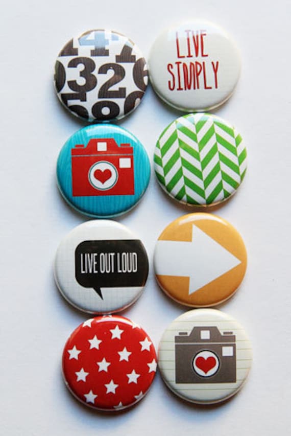
I used several flair buttons in my page and gathered them all close to the photo, the center of the attention. Can you spot all five in the page? Some are more hidden than the others as I love to layer! I followed the same color scheme with the flairs as I used in the rest of the page.
Thank you for stopping by today! Have a great day!
Sets used:
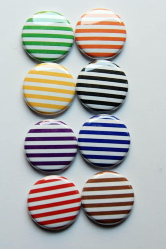
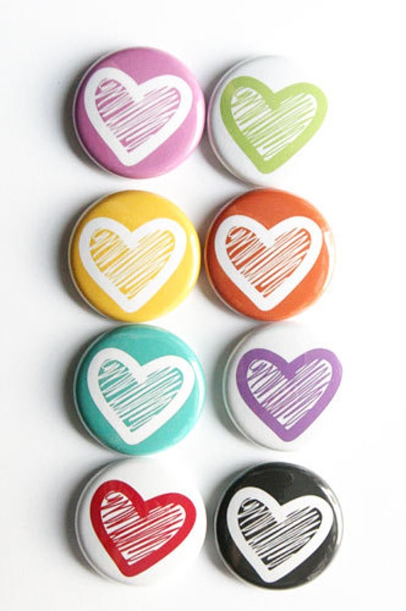
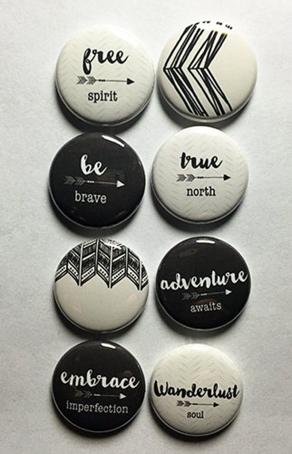
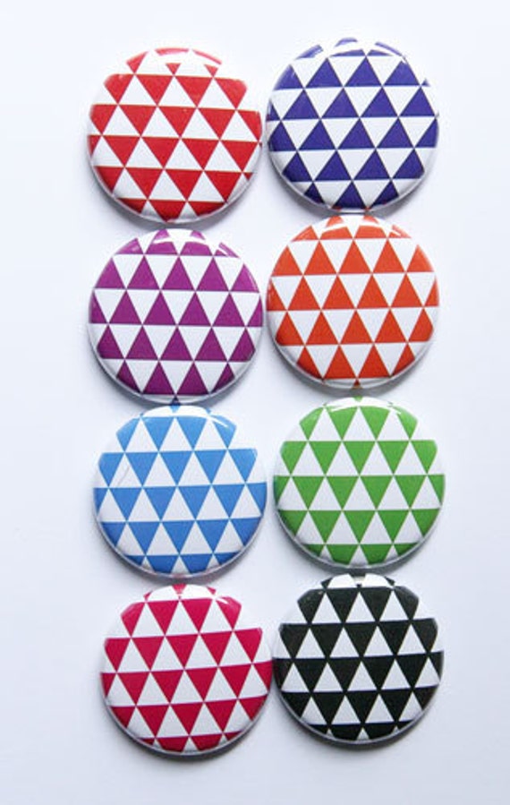
Materials: A Flair for Buttons, 7 Dots Studio, Prima Marketing, American Crafts, Lawnfawn, Scrap FX


No comments:
Post a Comment