
Moikka! I hinted in my first post for WOW! Embossing Powder this month that I'd be playing with translucent powders in this post as well. I also said that the look is totally different. Whereas I made stamped or painted translucent single layers in my first project, now I'm building thick layers.
But why use translucent powders for thick layers? It's because of the composition. Opaque powders have white in them, which makes them opaque. Usually you don't see the white, but when you heat the powder too long, you might have noticed that the powder starts to marble or white streaks appear. In order to avoid that happening when layering, I recommend using translucent powders. That way you know what you are getting and on the plus side can also make interesting color combos and layers as the colors let the other colors show through.

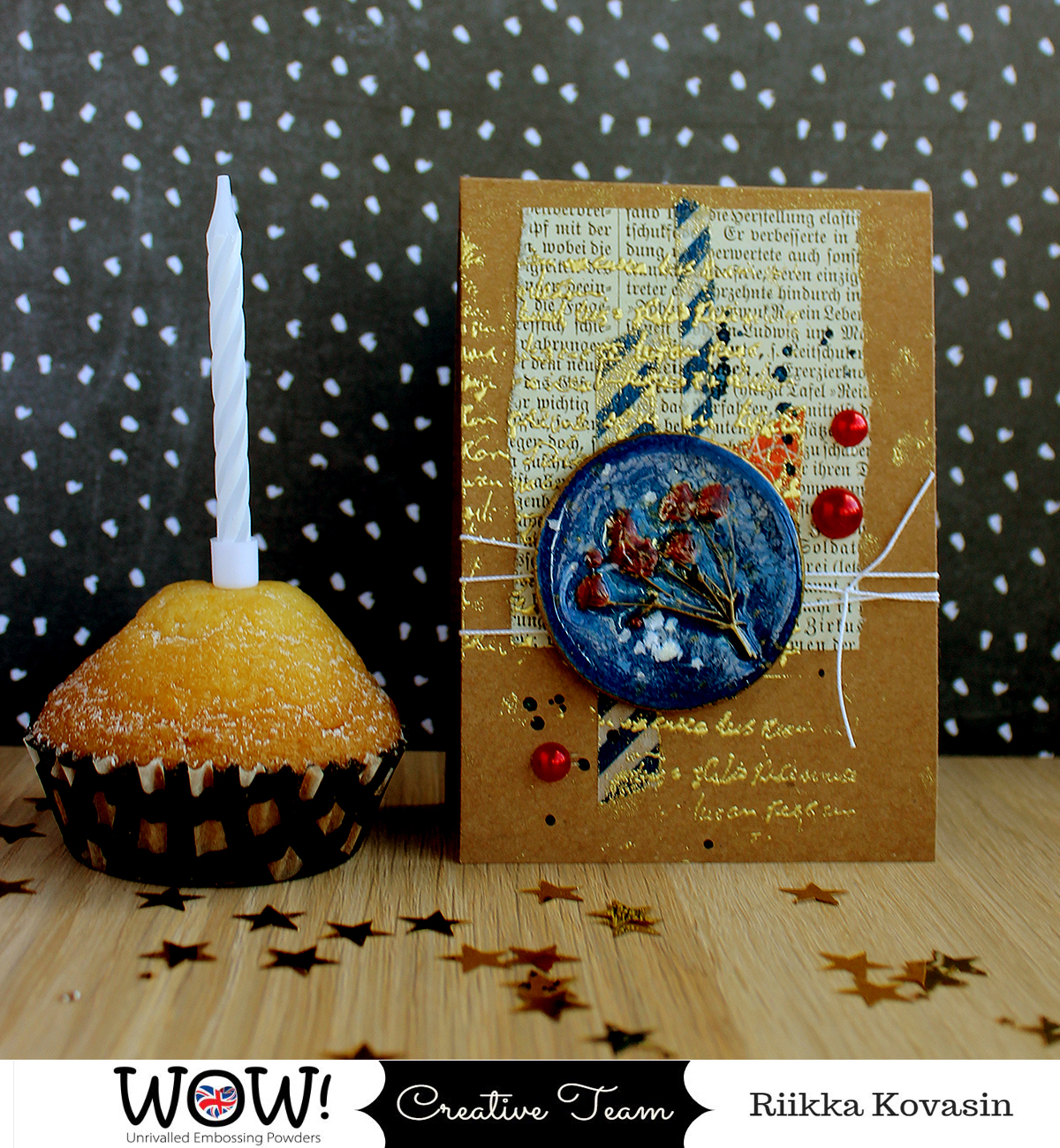
For these little cards I mimicked resin. To have that thick and shiny look to them, I used several layers of embossing powder and covered several of my pieces with "Clear Gloss" powder. I made four different embellishments using the similar idea - building thick layers. The first is a marble looking dot, second has a dried flower capsuled inside, third one has glitter and sequins inside and then the fourth has some embossing folder patterning. If you want to see how I made the embellishments and the cards, please see the video underneath!
As you saw from the video, all of the embellishments are done on top of die cut coaster circles. I wanted them to have a sturdy base that wouldn't warp with the weight of the powder and the constant heating. To give the embellishments more of a resin pendant feel, after making the embossed layers, I treated the edges of the circles using wax. You could use paint as well or even a thin metal plate if you really want to imitate the pendant look.
While these cards aren't as vibrant as the first card, I did use some out of my comfort-zone colors in these. The dots themselves are made with my almost go-to color palette of blue and purple, but for the cards I added some orange and red to keep things interesting. So even though the card base and old book page are of vintage tones I usually use, I did gain something from the exercise with the card I shared earlier in the month.
Thank you for stopping by today! Stay safe!

Materials from WOW! Embossing Powder:

Materials: WOW! Embossing Powder, Varalusikka, Sinelli, Teippitarha, Sizzix


No comments:
Post a Comment