Moikka! Yesterday I shared a layout with a video and guess what's in for today? A layout with a process video! This time the page is made for A Flair for Buttons.
The layout is about how I love to attend art museums with my two daughters. The colors of the page as well as the flag button hint where we were when I took this photo. In the United Kingdom, London, visiting Tate Modern.
The layout is about how I love to attend art museums with my two daughters. The colors of the page as well as the flag button hint where we were when I took this photo. In the United Kingdom, London, visiting Tate Modern.
My daughters are not strangers to museums. We've been visiting different art exhibitions and museums all of their childhood. When they were younger, the visits were naturally quite short and we thought a little what they'd be interested to see, but now I enjoy exploring art with them. I love to hear what they see in expressionist pieces, for example.
As the topic of the page is partly Tate Modern, I wanted to make somewhat minimal page with clear elements. That's why I started by painting a red circle to my layout. I recorded a video while working on the page so you can see how I made it! I hope you enjoy!
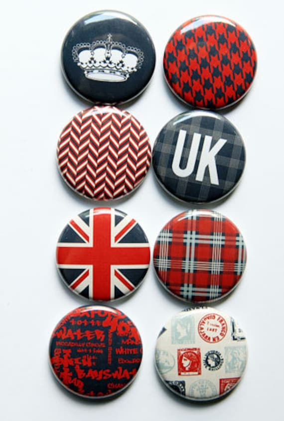
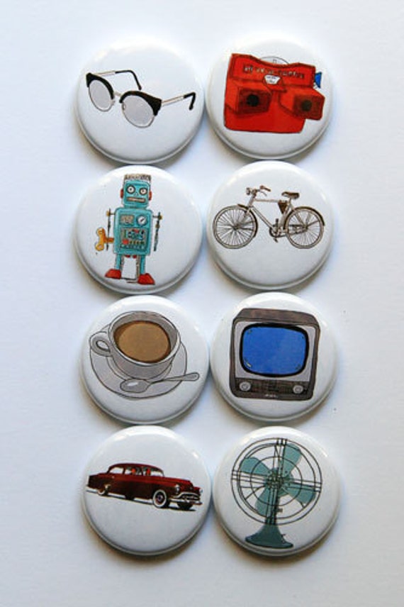
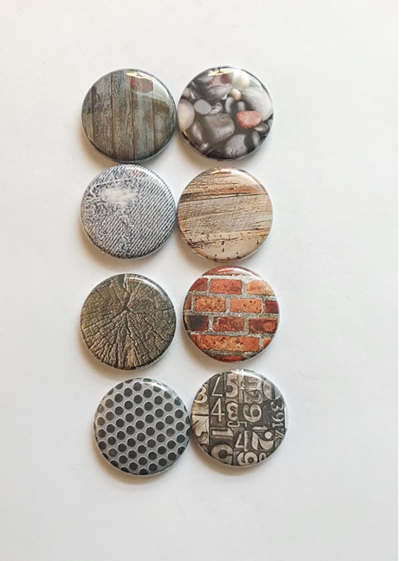
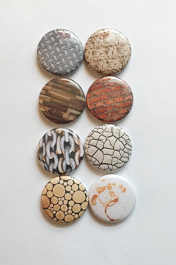
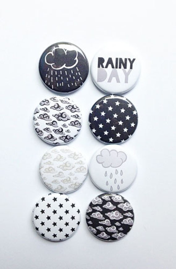
As you can see from the video, I had again selected some flair buttons to start with and then edited my choices when making the page. The Union Jack is from UK set and just needed to be in there. I also thought that the View-Master fitted not only the color palette but also the theme of looking art and seeing it differently. The machine is from the So Retro 3 set. The grungy textures of jeans, knit and wooden boards are from the two textures sets, Texture 1 and Texture 2. Last but not least the black background star flair, which is from Rainy set, balances the black bits of the title and brings a lovely modern twist.
Thank you for stopping by today!
Sets used:


Materials: A Flair for Buttons, 7 Dots Studio, Prima Marketing, Ranger


No comments:
Post a Comment