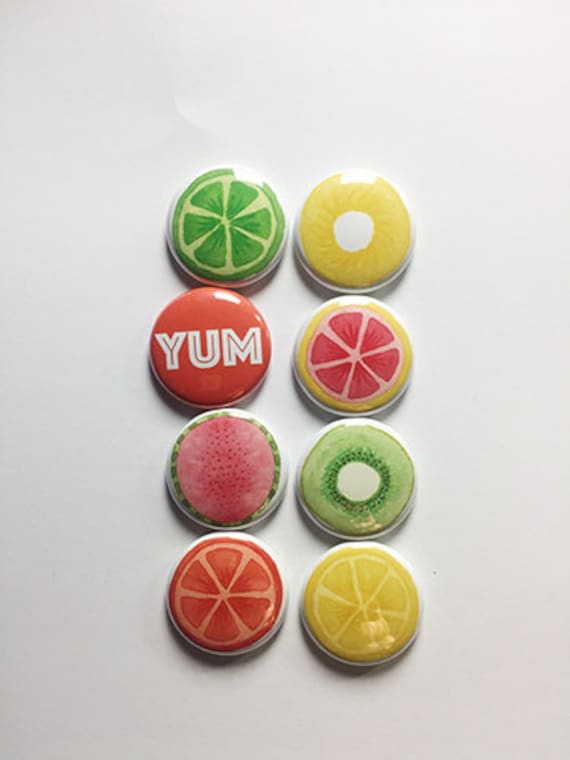
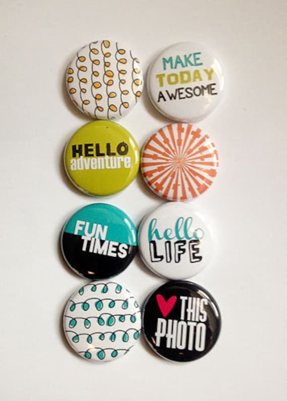
Moikka! How's your March been so far? Signs of spring in the air or is it in full swing already? I notice that the ever increasing amount of light makes me always turn towards certain colors. Each spring I start to notice all things yellow and crave a little yellow here and there. This page was inspired by the funny picture of my daughter but also the gorgeous fruit slices in the flair, but I'm sure that the spring, too, effected the colors scheme.
The page is about my older daughter who's at times a lovely breath of fresh air. It's really great to talk to her and hear her view of the world and how things run. It's always very eye-opening. I wanted to use that funny photo of her, which is actually taken by my other daughter, as it shows her goofy side and really underlines about the thing I said about opening eyes, quite literally.
To give the page a fresh touch I used greens and yellows on it. I tore a piece of lime green paper on top of the white patterned one and mixed in some watercolors and stamping. I also made sun rays using inking tool and inks and inked along a piece of scrap paper. That's why the other side of the ray is crisp and other smudgy.
To balance the composition and tie everything together, I placed my flairs to a triangle shape with the photo inside the three. There's two from the Fruit Slices set going with the fresh, green color scheme and then a saying one from Hello Life set. Each of the flairs have accompanying cluster of embellishments - some candy shaped stickers and a couple of epoxy stickers, too.
Thank you for your visit today! Have a great day!
Sets used:


Materials: A Flair for Button, 7 Dots Studio, Prima Marketing, Tape Garden, Ranger, Doodle Bug Design, American Crafts, Lawn Fawn


1 comment:
So cute. I like the simplicity of the layout. Great ideas on your blog!
Post a Comment