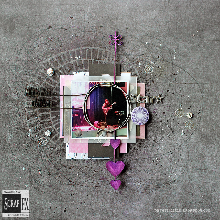
Several months ago I asked in my blog's Facebook what you'd like me to post about. Of course I shall continue sharing the crafts and DT work I do, but I wondered if there's something more that you'd like to know. Like something about the mediums I use, my favorite supplies, about my process or similar. What was suggested was a post about inspiration. So I decided to start a series of post concentrating on something that inspires me.
Here's links to previous posts on the series:
6) Inspiration: Instagram
7) Inspiration: Moodboards
8) My favorite supplies
9) Inspiration: Events, crops, workshops

7) Inspiration: Moodboards
8) My favorite supplies
9) Inspiration: Events, crops, workshops

I didn't know the topic for this post yesterday but when I started to think while heading to work I though maybe the obvious subject good be the thing. Well, obvious only for a scrapbooker, maybe. So this time I'm concentrating on photos and their stories.
For me the number one source for inspiration is the photo I'm using or choosing to use. Usually the photo tells a story I want to tell and record. Or then the photo is a part of the story I want to record. Like in the page above - the photo tells the story but it needs some wording to clear it to others.
Photo can be also something more conceptual, something that more sets the tone of the page. Like a photo of my worktable or sunrise - those can be used for many subjects or then I'm just doing an inspirational page for myself. They might have a cool quote what I've found over Pinterest or something I just feel I need to do for myself at the moment.
What a picture can also provide for the page is the colors. Nowadays I'm noticing I'm turning more and more into black and white photos as I find the colors of the photos overpowering in a way, but if I'm using a colored photo it's very likely to influence to my choice of colors. I rarely work with opposite colors, so if the photo is highly green-tinted I won't choose red as the main color for the background. Photo can also affect the color scheme in another way even if the photo is b&w. That's because of the subject - if there's an autumn feel or a beach photo or anything that naturally turns into a color scheme, I'm likely to use it. Like orange, yellow and red for autumn and blues for beach.

Then there's sometimes a photo that just screams to be scrapbooked. Not in the way that it holds a story but because it's just a lucky shot where all fells in the right place. It like needs to be "framed" in the page, treated a little bit differently than the rest of the shots. Of course those kinds of photos could also be framed or turned into other kinds of projects but I guess it's because I'm most of all a scrapbooker that I first turn to layouts then. Also scrapbooking layout is an easy choice as the photo goes in in such a late stage so if the project is ruined along the way, I won't ruin the picture.
I normally use just one photo in the page as you can see in the layouts I've added to this post. I find it hard to make a balanced page with multiple photos. Two is ok, but with three or even more I'm lost. But what multiple photos could do even better than just one is just that story telling. Multiple photos can make up like a cartoon strip, illustrating the story. Or then they can make the looker think what combines the photos. Back in the day I did a layout with three photos - photo of cows, photo of a milk carton and photo of my girl. You start making connections between the photos instantly and those connections make up the story.


For me the number one source for inspiration is the photo I'm using or choosing to use. Usually the photo tells a story I want to tell and record. Or then the photo is a part of the story I want to record. Like in the page above - the photo tells the story but it needs some wording to clear it to others.
Photo can be also something more conceptual, something that more sets the tone of the page. Like a photo of my worktable or sunrise - those can be used for many subjects or then I'm just doing an inspirational page for myself. They might have a cool quote what I've found over Pinterest or something I just feel I need to do for myself at the moment.
What a picture can also provide for the page is the colors. Nowadays I'm noticing I'm turning more and more into black and white photos as I find the colors of the photos overpowering in a way, but if I'm using a colored photo it's very likely to influence to my choice of colors. I rarely work with opposite colors, so if the photo is highly green-tinted I won't choose red as the main color for the background. Photo can also affect the color scheme in another way even if the photo is b&w. That's because of the subject - if there's an autumn feel or a beach photo or anything that naturally turns into a color scheme, I'm likely to use it. Like orange, yellow and red for autumn and blues for beach.

I normally use just one photo in the page as you can see in the layouts I've added to this post. I find it hard to make a balanced page with multiple photos. Two is ok, but with three or even more I'm lost. But what multiple photos could do even better than just one is just that story telling. Multiple photos can make up like a cartoon strip, illustrating the story. Or then they can make the looker think what combines the photos. Back in the day I did a layout with three photos - photo of cows, photo of a milk carton and photo of my girl. You start making connections between the photos instantly and those connections make up the story.

Sometimes it can also work other way around - I have a story to tell or record and don't have a photo for it. If possible, I could then take a picture for the story, but usually I'm impatient and work my way around it. That is I'm using a photo that relates to the subject or if it's a personal memory or connected to me, just use a selfie.
I've also done a few pages without any photos at all but they pose a challenge as the photo is natural vocal point of the page. Human eyes are naturally drawn to faces and especially eyes, so lacking that pull of the photo, you need to find something else to draw the attention in. But some pages really work better without any photo so that's also something you could consider when starting to work on a new layout!


I hope you found this post interesting or perhaps even inspiring! I'll post another source and a few ideas how to use it next month. Please also remember the "Inspired by" posts as I usually try to open up my process in them!
I've also done a few pages without any photos at all but they pose a challenge as the photo is natural vocal point of the page. Human eyes are naturally drawn to faces and especially eyes, so lacking that pull of the photo, you need to find something else to draw the attention in. But some pages really work better without any photo so that's also something you could consider when starting to work on a new layout!

Here's just a few ideas to get you going:
- you are probably using the current photos to your pages but what about taking another look to the older ones? Maybe they unravel a different story now than back then
- remember "The Whatevers" (link)? Print out a photo and make a page with that - invent the story!
- use a photo of a certain subject and use it in on a completely different, make a new connection between the topic and the photo
- find your own childhood photos and make a page using them
- juxtapose two photos and make up a story between the two, use for example a photo of you and a landscape, you and your child, same spot night and day...
- make two layouts using the same photo but with a different story, see how your story affects the over all page
- do you have a photograph museum nearby you? or search the internet for inspiration and take photos differently - use a different perspective, go micro or macro
- challenge a few friends to use the same photo in their pages and see how different the results are - and what kind of stories there were
- do a page without a photo
- challenge yourself and use a different number of photos than you usually do - if you use just one, use multiple and the other way around
- document your camera
- pick colors for your page from the photo
- pick colors for your page from the photo

I hope you found this post interesting or perhaps even inspiring! I'll post another source and a few ideas how to use it next month. Please also remember the "Inspired by" posts as I usually try to open up my process in them!
Thank you for stopping by today!


2 comments:
A very inspirational post indeed! I must try creating a page without a photo :)
Thank you - great to hear the post inspired you!
Post a Comment