
It's again the 10th of the month and time for the "Inspired by" creation! But what is Inspired by? Every month awesome Marsha and I choose a subject to be inspired by. It can be a movie (link), an item (link), a designer (link), a painting (link) or a piece of music (link). Then we make something inspired by that theme or a piece of art and share it with you and each other on the 10th of the month.
Our source of inspiration this time was a "back to basics" approach. We took a trip down the memory lane and thought about how the first challenges were movie based. So we chose to use a movie this time. As the screenings in the Netherlands and in Finland are not the same we had to compare the choices available and luckily "Mr. Turner" was on both our lists! What makes it more funny is the lead actor, Timothy Spall, who also starred in the "Shooting the Past" miniseries we draw inspiration from not so long ago.
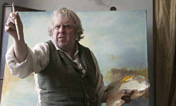
The movie is about Joseph Mallord William Turner, an English landscape painter. In the time when the great historical pictures reigned this painter revolutionized the way to capture and present nature. He's said to be the master of light and the legend has it that his last words were: "The sun is God". The movie paints an image of highly controversy figure, intransigent master and eccentric person. Where the character is rugged and even somewhat unpleasant his paintings are quite the opposite. They are soft, intriguing and hazy. They are so expressive and like poetry on canvas.

I went to see the movie after a hectic day at work. At first it's slow tempo felt too slow but then I got emerged to the film. And after screening, walking to the tram stop, I was completely captivated, thinking about the themes it had, the way the complexity of the character unraveled and how the story folded slowly, like a river.
Then came the hard part. The decision what to do. Like I WhatsApped to Marsha - the movie had loads of sources for inspiration and then none. I didn't connect with the story that much that it would lead me to create something. Yes, I love my father and family, but somehow that wasn't the right creation for this. And I also love my husband and the relationship we have. But as the both relations are nothing like those portrayed in the film, it felt odd to choose these as the topic. And then there was a lot of visual keys that could have been used. And then there was the art. Those gigantic paintings of frozen moments. I chose to go with the latter and try something I've been yearning for some time.


Our source of inspiration this time was a "back to basics" approach. We took a trip down the memory lane and thought about how the first challenges were movie based. So we chose to use a movie this time. As the screenings in the Netherlands and in Finland are not the same we had to compare the choices available and luckily "Mr. Turner" was on both our lists! What makes it more funny is the lead actor, Timothy Spall, who also starred in the "Shooting the Past" miniseries we draw inspiration from not so long ago.
The movie is about Joseph Mallord William Turner, an English landscape painter. In the time when the great historical pictures reigned this painter revolutionized the way to capture and present nature. He's said to be the master of light and the legend has it that his last words were: "The sun is God". The movie paints an image of highly controversy figure, intransigent master and eccentric person. Where the character is rugged and even somewhat unpleasant his paintings are quite the opposite. They are soft, intriguing and hazy. They are so expressive and like poetry on canvas.
I went to see the movie after a hectic day at work. At first it's slow tempo felt too slow but then I got emerged to the film. And after screening, walking to the tram stop, I was completely captivated, thinking about the themes it had, the way the complexity of the character unraveled and how the story folded slowly, like a river.
Then came the hard part. The decision what to do. Like I WhatsApped to Marsha - the movie had loads of sources for inspiration and then none. I didn't connect with the story that much that it would lead me to create something. Yes, I love my father and family, but somehow that wasn't the right creation for this. And I also love my husband and the relationship we have. But as the both relations are nothing like those portrayed in the film, it felt odd to choose these as the topic. And then there was a lot of visual keys that could have been used. And then there was the art. Those gigantic paintings of frozen moments. I chose to go with the latter and try something I've been yearning for some time.
Mr. Turner was a painter, creating the foggy flashes of paused time with oil paints. I love how determined he was capturing just the right light and the way clouds really moved across the sky to portrait a storm that he had himself tied to a mast of a ship then steered into a snow storm. He treated the paints very different from his peers. To me those paintings remind me of the Impressionists. And more over, they remind me of pastel paintings.
I attended a high school that had two emphasis to guide the studies - either natural science or art. I took them both ending up with quite an excessive amount of courses by the time I graduated. For my diploma work in arts I studied how people dressed and made a piece inspired by that. In the exhibition of the diploma works there were pastel paintings. The student who had made them had just had a baby and she had made a series of small pastel paintings of her newborn. They were so lifelike, so beautiful and soft that I still remember walking up the stairs to the exhibit and seeing them on the wall. After that I've used pastels in several occasions but I have never done an actual pastel painting. So inspired by the pastel style qualities of Turner's paintings I decided to have a go. I've also seen masterful works of art done using PanPastels so I went with those.
In the movie there's a few scenes that show Mr. Turner painting. One of the scenes is him prepping a canvas, applying a pale yellow wash to it. So I started the same way - the first thing I did was to rub different shades of Gelatos to my art journal and spread those with water creating a watercolor like shading on the white page. On top of that layer I then started to paint with the pastels.
Three colors stuck out to me in the movie: bottle green, pale greyish blue and most of all, yellow of aged painting and papers. It seems to me that the whole color scheme is a bit tinted with yellow changing the colors to those of old masterpieces. At the beginning there's more golden hues - to me marking the golden age of the painter, the relationship with his father and the prosperity and in the end the palette changes to more greyish one. I wanted to use the golden color in my piece, but instead of using the robin's egg blue or dark, rich green I chose to go with the complementary color - purple. I tinted the bottom of the page in yellow and the top with the lilac. Then I drew a soft pencil line across the page marking the horizon and started layering the colors on top. And oh how I enjoyed painting with the pastels! If you have those at home, I highly encourage you to have a go! Absolutely captivating!
The scene I captured in the page is an imaginary one. The silhouette is real - it's that of the Helsinki Cathedral. But even in the best morning mist you couldn't have just the church standing alone in the fog but also the city round it. But the idea is to capture a sign, a symbol of Helsinki, my home town in a beautiful, serene way. As the movie is about the love in a way - love for the father, love for the painting, love for the light - I decided to do a piece connected to the town I've learnt to love.
I added touches of color to the silhouette with PanPastels but used a pencil and pastel pencils to really draw the outline. And I tried not to "draw" it as such but rather try to have light shape it out adding strong white to the other side and purple and orange shadows to the other.
But enough about me babbling! Let's visit Marsha! Can't wait to see what she has done! Thank you also so much for stopping by today! If you have seen the movie, too, please tell us your impressions!
Materials: Design Memory Craft, Pan Pastels, Prima Marketing
3 comments:
Yes, yes, yes! I'm glad you decided to go with something you were yearning to do! Look at what happened! It's beautiful!!! And unlike mine, I can really see the Turner influence! I've figured out that I tend to live in my head at the beginning of a new year... You'll see when you read my post... But oh man, I love your result. I'm so proud of you!
WOW.... you have just blown me away. Your mind works in a wonderous way. This is gorgeous <3
So very pretty! A beautiful work of art!
Post a Comment