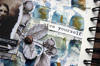
Hoppy Easter! Hopefully you've had a pleasant and peaceful Easter holiday. I'm sharing my project for Art Daily Cafe today. It's for April, where I'm also the one who came up with the theme! This month's theme is "Through a veil", the color is smokey blue and technique is playing with translucent and opaque layers. You can see the original post here (link) at Art Daily Cafe. And here's the direct link to the theme reveal post (link).
Before jumping to today's project I have exciting news to share! As of this month, I'm a member at Nathalie's Creative Squad! You can see the announcement post here (link) at Nathalie's blog. Can't wait to show my first Squad project to you!
For the Art Daily Cafe project, I played with opaque and translucent layers, used smokey blue in my project and interpret the theme ”Through a veil” quite literally as well as metaphorically.
As you can see, I added several layers of vellum on top of the other photo. That’s my literal take on the theme – you can see the photo only partially as faded lines as it’s hidden by the vellum layers. But I also thought about the theme in a more metaphorical way – how memories start to fade, like the events and people would be seen through a haze. Naturally there’s some memories that shine like a bright beacon, but some others then again start to fade after time. That makes me think about a scene from a Pixar movie “Inside Out” where the forgetter crew are vacuuming the memories but hold the chewing gum commercial dear. It also makes me think how different senses can provoke memories – like how a scent or a tune can make you remember something, which you think you had forgotten.
The angle I took to memories and forgetting was a slightly different one. My maternal grandfather passed away this year. He was the last one of my grandparents. It’s mind boggling that from a certain, personal point of view a whole generation is now gone. I’m so blessed that my two daughters got to play with their great grandpa and have a lot of good memories with him! The phrase I included in the spread, “give yourself permission”, is kind of an advice for myself. Like it’s ok to let some things slip, ok to forget something but treasure other things.
I used the translucent and opaque layers on several occasions. First I used watercolors to make the background paper – a translucent medium. Then I added some opaque acrylic paint, which I partly treated with Soft Matte Gel to make it translucent. When stamping I chose both solid and more open design stamps so there’s the illusion of more opaque and translucent layers. I also used translucent washi tape and vellum in the page whereas most of the other elements are opaque.
There’s maybe hints of smokey blue in the watercolor background, but I mainly used it in the acrylic layer and as the stamping ink. As this month’s theme is by me, I recorded a video while making the spread. So, if you want to see how I made the background and the layers, please see the video underneath.
Thank you for stopping by today! Wishing you a lovely week!
Materials: Prima Marketing, Ranger


No comments:
Post a Comment