It's again the 10th of the month and time for the "Inspired by" creation! But what is Inspired by? Every month awesome Marsha and I choose a subject to be inspired by. It can be a movie (link), an item (link), a designer (link), a painting (link) or a piece of music (link). Then we make something inspired by that theme or a piece of art and share it with you and each other on the 10th of the month.

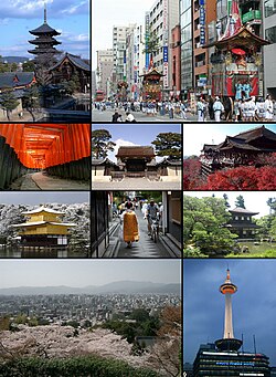
This time we had something new to be inspired by - a city! We both have visited Kyoto and we chose to be inspired by it. It's such a lovely city, former capital and city of thousands of shrines.
My husband and I visited Japan back in 2008. We flew to Osaka and took a bus right away to Kyoto. We stayed there a few days and then continued to Tokyo from where we flew home. I simply fell in love with Kyoto. It's whole atmosphere was great and had something stopping, pausing and peaceful about it. It had a grace about it. We visited numerous shrines and temples while in there but also took a stroll in the park and ate well.
What struck me the most was the respect for the old - old buildings, heritage and the kind of two faces the city had. There's the new side with the train station and office buildings and the mall but there's also the old temples, big parks and ryokans.
So I took that duality as my jumping of point and created this canvas. It was at first really hard to think how I would capture the city, but remembering the old temples and the bullet train station gave me the right push. The background of the piece consists of modern things: lamps, cables, computer parts and a plastic fork, among others. On top of them is an old tea sieve. If you've been following my blog lately, I think you might guess where it's from - my grandpa's. The sieve forms a sort of nest for a paper crane inside. I folded the crane out of a page of an old book.
The crane obviously refers to Japan, but it also has a more personal meaning. We sent cards to home from the trip. I had an idea for them before we left so I made some preparations and printed out the folding directions of the paper crane. Then after we bought some origami papers at Kyoto, we sat in the park, sun shining, and wrote our greetings to the origami papers, then folded them into cranes and put them inside envelopes together with the folding instruction so that receivers knew the crane should be opened.
I'm actually not sure where the color scheme came from. Somehow just along the way I started seeing the canvas in black even though it's not the color I would pick for Kyoto. The greens I added on top are more Kyoto than the black. But I guess lacquer red, temple gold and forest or park green would be the combination.
But like I said, during the creation I just started the see the project with black background with hits of color. The black parts are painted with black gesso and the sieve is treated with clear gesso. For the color touches I used mists, Silks paints, High Impact paints and also some glitter.
But now, let's go over to Marsha's and see what she has created! Somehow I have a feeling that this time we're making something completely different!
Thank you for stopping by today! Have you visited Kyoto? Please share your impressions!
Materials: Prima Marketing, Tattered Angels, Luminarte


6 comments:
Yep, you're right. It's different! Though we both used the dark grey/black. For me it represents the pewter colour I saw everywhere. So it's definitely a Kyoto colour :-). This is absolutely beautiful! I love the old and the new and I'm always amazed and how you can make a plastic fork look stunning! <3!!!
wau!
Really stunning. I really like how you used these materials. I can't stop looking at it.
Regards, Leonie
Thank you sweetie :D
Kiitos :")
Thank you :")
Post a Comment