
Hello there! Have you seen the new Prima challenges? I just loved the PPP colors! No wonder as they are my favorite ones: blue, turquoise and greens. Here's my take on the challenge, a layout using the color palette.
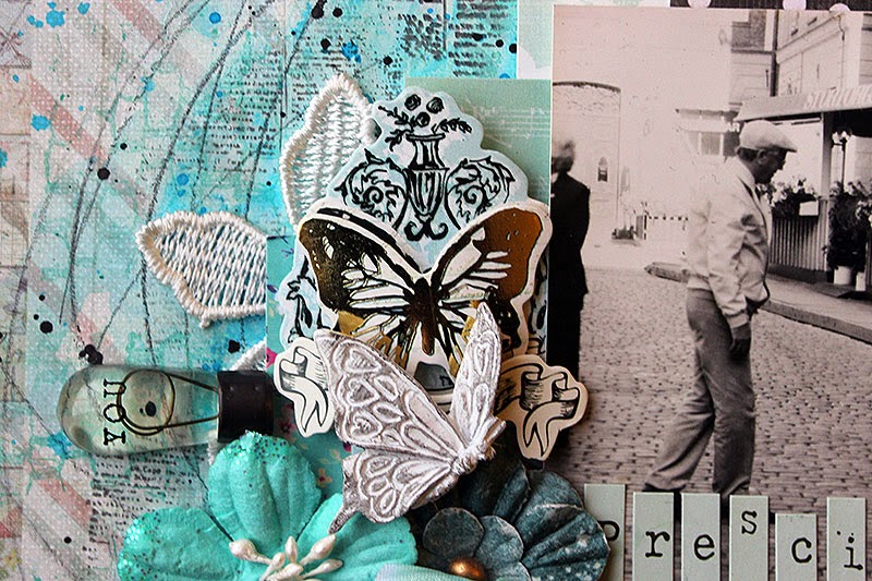
The topic of this page is my maternal grandmother. The title, precious, refers both to her and that photo. It's an actual vintage one, not a scanned version as I found two exactly same photos so I got to use the other one here. The picture is taken in Stockholm while on a summer trip there. I have no memory of the trip itself but I do enjoy looking at the photos.
My grandmother died when I was in my early teens and I didn't get to know her as well as I would like. I was still a child when she passed away and it would have been lovely to talk to her when I was more grown up.

I guess it doesn't show too much that I had very limited supplies in the right colors! I started this page by adding a piece of patterned paper on top of plain colored card stock. On top I added gesso, mists and a stenciled layer of mist, too. I also added some stamping and the pencil swirls. Then a few patterned papers behind the photo and finishing touches with the embellishments.
Thank you for looking!
Materials: Prima Marketing, Tattered Angels, Ranger, Tsukineko, Design Memory Craft

1 comment:
Love the colour mood! Sooo beautiful and inspiring!
Post a Comment