Showing posts with label PPP. Show all posts

07/07/2016

You create magic - Prima Marketing


Hello there! There's quite a few challenges going on in the Prima blog now - yesterday I posted about the 30 days watercolor challenge and today is the monthly challenges. Usually there's two - BAP and PPP but this month there's a third one also! It's called CAT - cards and tags! You can find all the challenges here (link) at Prima blog.

The CAT challenge has a sketch of it's own. This time it's square shaped but it can vary. And naturally you can interpret it the way you want! I used both the CAT and PPP challenges while making the card but you don't have to use the color palette of the PPP in your make.


I interpret the sketch with many overlapping paperlayers put on an angle on top of each other instead of thin strips near the edges. It was fun combining different patterns and colors! 

I embellished my card using two roses and adding some fiber from the “Aspen Blush” loom kit underneath. The inspiration for that came from the PPP board. For the sentiment part I used a rub-on word together with a stamped greeting. You create magic!


Materials:

584382 – Vintage Emporium 6x6 Collection Kit
990541 – A Victorian Christmas 6x6 Paper Pad
911270 – Julie Nutting 6x6 Paper Pad
584252 – Watercolor Confections The Classics
961442 – Heavy Gesso White
585631 – Rub-On Foil Sheets Golden Girl
586188 – French Riviera Flowers Deep Blue Sea
586034 – Loom Kit Aspen Blush 
971397 – Adhesive Rub-Ons 
962067 – Now is the Right Time Cling Stamp Set
580421 – Water Brush set 
962760 – Brush Set 
963880 – Silicone Brush 2”


Materials: Prima Marketing, Ranger


03/06/2016

Metal panel cards - Prima Marketing


Hi there and happy Friday! The new Prima challenges for June have been published! You can find both the PPP and the BAP challenges and a lot of inspiration here (link) in the company blog.

The PPP palette is inspired by the colors of the year 2016 by Pantone and have a peachy soft pink or orange in it together with baby blue. The BAP on the other hand is again drawn by me. I'm so honored and excited that if my memory serves me correctly, I've done every sketch during my DT year. I do hope you have liked them!


I did two cards for the PPP challenge. I was first of all inspired by the black and white patterned piece in the PPP collage as well as the metallic acrylic paint. My first vision was actually iconographic art and I played with the idea of using Bloomgirl stamps as the center of attention, turning them into saints or angels, but then I decided against it. Instead I chose to do some pretty flower cards. 

The flower pattern on the side of the cards is cut from the Coloring book and colored with watercolors using a water brush. The other side on the cards is painted with the rich Metallic paint. The combo could be a modern version of iconographic art, don't you think? On top of those two elements I then added just a few blooms to decorate the cards. 

Happy weekend to you all and please join the challenges at Prima blog! 


Materials: 

585723 – Watercolor Coloring Book
847722 – Watercolor Paper Pad 6x6
963095 – Metallique Brass Hardware Acrylic Paint 
584269 – Watercolor Confections Tropicals
576691 – Watercolor Pencils Scenic Route 
584351 – French Riviera 12x12 Collection Kit 
586133 – French Riviera Saint Tropez
586539 – Vintage Emporium Verona
963323 – Melange 
892319 – Junkyard Findings Metal Door Signs
576110 – SIIC Aquamarine 
580421 – Water Brush set 
962760 – Brush Set


Materials: Prima Marketing

05/10/2015

What if... - Prima Marketing


As always the turn of the month means new challenges! And I don't talk about those coming with autumn or turn of the clock (eek!) but of course the Prima ones! Here's the link to the original challenge post with the PPP and BAP challenges (link).


The PPP board is full of wonderful details and the colors are spot on for those inky blue autumn nights. But let me first share a word about the BAP. As the sketch is by me! I feel so honored and in awe that my sketches are picked for the challenges! And more over I'm overjoyed to see how they are interpret by the DT and by the wonderful people joining in to the challenges! So thank you all so much for those beautiful creations and inspiration! 


But back to my take on the PPP challenge. I decided to do a book cover / canvas this time. The first things that got my attention in the board were the weathered wood underneath the La Rochelle Antique Trinkets and also the leather on the left. The feeling of the board also turned my thoughts to times long gone. 

So I rummaged through the Finnabair Ephemera pouch for inspiration and decided to use one of the pictures from there as the focal point. I used Chalk Edgers together with the Oil Pastels to turn the pale wood into weathered one and also included the wonderful leather like paper from the Memory Hardware collection into my piece.

Thank you for stopping by today! Wishing you a lovely start to the new week!


Materials from Prima Marketing:

962883 – Finnabair Ephamera pack
572938 – Wooden ATC Not Too Shabby 
990404 – Leather Paper
583651 – Paper Doilies
960582 – Resist Canvas 12x12 Checkered 
990725 – La Rochelle Antique Trinkets 
582746 – Paper clips
961107 – Mechanicals Pendants 
569617 – School Memories Wooden Buttons
961992 – Cling Stamp Set Dream On
961367 – 3D Gloss Gel
814328 – Oil Pastel Crayons
890995 – Chalk Edger Black Coal
891077 – Chalk Edger Old Road 
962760 – Brush Set


Materials: Prima Marketing, Ranger, Sakura

09/08/2015

Bliss - Prima August PPP


Hi there! Yesterday I shared my take on the Prima's BAP challenge for August with the sketch designed by yours truly and today it's time for the PPP! I fell in love with the board as soon as I saw it - so delicious colors! Here's the link to the original post with some fabulous art to get your creative juices flowing (link)!


The kiwi fruit and the green colors turned my thoughts to green apples so I decided to do an altered fairy tale apple. No, it's not an actual, real, edible apple but instead a styrofoam one I painted. And tell you the truth, it started out as a red one but luckily some heavy gessoing and painting turned it into a green one. The coloring is done with some touches of acrylic paint but mainly with mist, Mica powder and watercolor pens. The flowing colors ended up turning my craft mat also greenish!

I used teal colored blooms and added some silver sparkle with Glass Glitter also inspired by the board. To finish the piece I added a delicate butterfly as you can see several flying around the board. The butterfly is created simply by stamping the image with solvent ink to transparency. 


Do you want to hear a little teaser? Actually this is my second altered apple - the first one is going to be shown also during this month but just a little bit later and there just might be a video about the creative process as well!

Thank you for stopping by today! Have a great start to the new week!


Supplies from Prima:

961398 - 3D Matte Gel
961374 - Heavy Gesso White 
962500 - Mica Powder Green 
577766 - Rodanthe Seashell
961435 - Soft Gloss Gel
892494 - Stamp’N’Add - Angels Wings
573782 - Color Bloom Soft Teal
576714 - Watercolor Pencils Basics 
576721 - Watercolor Pencils Spring and Fall
573201 - Seashore – Say It In Crystals 
564445 - Lady Bird Flower Stems
574598 - Luna Silver 
960322 - Mechanicals – Flowers Mini 
892319 - Junkyard Findings – Metal Door Signs 
961626 - Glass Glitter Sterling
962623 - Micro Beads Grass
962692 - Glass Beads Peacock Green
961565 - Glitter Set Caribbean Sea 


Materials: Prima Marketing, Tsukineko, Ranger

09/06/2015

Hello Word - GDT Prima Marketing


Looking for the hop? Please follow this link!

Yesterday I shared my first guest creation for Prima (oh my gosh) and today is the turn for the second one. You can see the introduction post here as well as my two guest creations.


The page above is created using the PPP palette. I actually used the PPP color palette in both of my layouts. As the BAP project had more of the green and teal side of the palette I chose to go with the orange and red in this layout. I also was inspired by the products shown in the collage – butterflies, roses and tiny touches of metal.

In the picture there's me with one of my favorite crafts so far - a heart canvas. I'm turning that one into a workshop and hoping to teach it during autumn by the way if you are interested!

Thank you for stopping by today! Tomorrow is the 10th and you know what that means - Inspired By!


Materials: 

846848 Epiphany Manifestation of Love
813840 Stationer’s Desk 6x6 Paper Pad
961442 Heavy Gesso White
961411 Modeling Paste 
576714 Watercolor Pencils Basics
576721 Watercolor Pencils Spring & Fall
962272 7x9 Stencil Chicken Wire
961893 Clear Stamp Messy
960926 Clear Stamp Fishnet 
892500 Stamp’N’Add Butterfly Wings
569792 Alpha Canvas Large White
549039 Backstage Sugar Blooms
575359 Stationer’s Desk Record 
961060 Mechanicals Washers 
960407 Mechanicals Flowers Small
573188 Stationer’s Desk Say it in Crystals


Materials: Prima Marketing, Ranger, Tattered Angels, Sizzix


26/04/2015

Fascinator - Prima PPP April


Hello and peaceful Sunday! Today I'm blogging my creation for the Prima PPP challenge. The color palette was so vibrant that it threw it off me first, but then I had an idea to include some neutrals in there as well. I guess also the movie that was playing in the background affected me as well. 

Even before I started staring at the color batches, I had decided that I would make something off the page for the challenge. And when I saw the colors the decision got even stronger. But what to do then? We had "My fair lady" in the background and the moment the Ascot dress of Eliza was showed I knew what I would go for. That dress (link) is one of my favorite movie costumes ever. The silhouette is stunning and I'm also drawn to the black-and-white color scheme. So that in mind, I went rummaging through my fabric stash and took a piece of striped satin as well as a piece of black velvet ribbon and some merry widow veiling. 


First I sewed the satin into a rosette and then added the pieces of the veiling and the ribbon in there. Then it was Prima time! I added some wire to add another dimensional piece underneath all the decorations, on top of the veiling. I made a few circles and some corkscrew style pieces as well. On top I then layered some Prima roses, fabric flower and also a few Mechanicals. As the PPP board had Glass Beads in the pictures as well as the flowers I added both of those in my project.

While I added the white and the black in the mix, there's also the colors from the PPP palette. The dark pink is in the decorative pins, light pink in the stamen. Green can be found in the leaves of the flowers. Yellow is a bit peachier, but it's on the type piece U and in the flowers. And the turquoise is in the glitter and beads in the center of the fascinator.

So, there's my project for the April PPP challenge! Thank you for stopping by today! 


Materials: Prima Marketing


23/03/2015

Incredible - Prima PPP March


Hello there and great Monday! The weather here in Finland ain't that charming, but I know sun is shining some part of the world! Last month I wasn't able to take part in the Prima challenges but this month I squeezed some time for them. So here's my take on the PPP challenge with a lovely blueish, greenish color palette. I'm sharing my take on the BAP tomorrow.


The palette was so me! With turquoise, mint green and tender shades of aqua, pale green and grayish pearl. I have been hoarding the packaging of the wooden icons quite a while now and I though to use it as my base. But what to include to the little openings? There's several different blooms in the PPP board and I happened to have several blooms matching the palette so I went with a blooming solution. 

I layered different flowers on top of each other to get a fuller look and then added some crystals to decorate the blooms. They are like dew drops on them. Underneath the flowers there's a piece of patterned paper and touches of the Finnabair white crackle paste. The frame also has touches of stamping here and there and marks with a pencil.

The big word is a chippie, covered with the crackle paste, Each of the flowers also include a word sticker thus spelling "family friends together forever". Talking about friends, I'm giving this piece away if someone would like to have it. Please leave a comment underneath or send me a mail.

Wishing you a great, incredible start to the new week!


Materials: Prima Marketing, Tattered Angels, ScrapFX, Ranger, 7 Dots Studio


14/01/2015

Precious - Prima PPP January


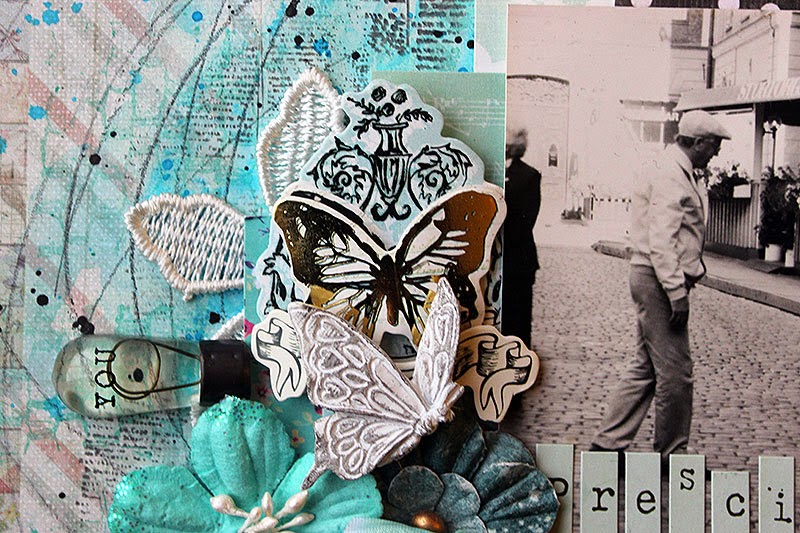
Hello there! Have you seen the new Prima challenges? I just loved the PPP colors! No wonder as they are my favorite ones: blue, turquoise and greens. Here's my take on the challenge, a layout using the color palette.

The topic of this page is my maternal grandmother. The title, precious, refers both to her and that photo. It's an actual vintage one, not a scanned version as I found two exactly same photos so I got to use the other one here. The picture is taken in Stockholm while on a summer trip there. I have no memory of the trip itself but I do enjoy looking at the photos. 

My grandmother died when I was in my early teens and I didn't get to know her as well as I would like. I was still a child when she passed away and it would have been lovely to talk to her when I was more grown up. 


I guess it doesn't show too much that I had very limited supplies in the right colors! I started this page by adding a piece of patterned paper on top of plain colored card stock. On top I added gesso, mists and a stenciled layer of mist, too. I also added some stamping and the pencil swirls. Then a few patterned papers behind the photo and finishing touches with the embellishments.

Thank you for looking! 


Materials: Prima Marketing, Tattered Angels, Ranger, Tsukineko, Design Memory Craft


28/12/2014

2014 - Prima PPP December


Looking for the giveaway? Please check here (link)!

Good Sunday! Yesterday I showed my take on the BAP challenge and today it's PPP's turn. Both are Prima's challenges and these are for December. I loved the multitude of metallics in the PPP board and used just metallics with black and white. I also was inspired by the wreath in the board and used that in my composition mimicking it with Prima wire and different blooms.


I always try to use also the products shown in the PPP board if I have some of them or even something similar. This time I had glitter and glass glitter shown it the board as well as the wire. I also had something similar than the white flowers. 

The topic of the page is one of the great moments in 2014. Yes, it's once again the trip to Paris and the twinkling Eiffel tower. It was one of the best moment in 2014. Also the black and white photo with the glimmering feeling fitted the metallic, glittery board.


The background is started with a circle painted with black gesso. It gave a lovely background for mists and metallic paints. I used a stencil and misted a golden color through it to the background. There's also some flicks with metallic paints and touches of glitter. The big paper blooms in the wreath are cut out from a patterned paper and I added some Prima blooms to accompany them.

Thank you for stopping by today! Let this layout be a count down start to the new year - for the next days I'm sharing some of my favorite projects from 2014! 


Materials: Prima Marketing, Tattered Angels, Sharpie


24/10/2014

This Place - Prima PPP October


Hi there! Yesterday I shared my take on the Prima BAP challenge and here's my go at the PPP challenge for October. The palette was a touch one at first sight but when I looked through my materials I noticed having items that fitted the scheme.


I really loved that patterned paper with the black dots! It's so fun and I really adore the big contrast between the dots and the pale, neutral background. With the two background papers I covered the black but none of my papers had the purple in the palette. So luckily there's mixed media and paints! I added some purple acrylic paint to the background and brayered it across the page. Then I made the black pattern on top using Finnabair's black gesso. The green is in the leaves, the orange in the blooms and the grey in the paper underneath the photo.

The story behind the layout dates back when I was about 18 or maybe a little older months. My parents took a trip with me and my grand parents to Stockholm and we visited Skanssen. I have no memory of the trip, but there's a lot of fun photos from it. And one of the photos is taken just in the spot where I have taken this one. The tower of the Nordic Museum showing on top of the trees. So whenever we visit the city and Skanssen, I tend to take a photo in the same place.

Thank you for your visit! 


Materials: Prima Marketing, Ranger, Sharpie, Design Memory Craft


14/09/2014

Happy - Prima PPP September


Hi there! Today I'm sharing you this page I made for Prima PPP challenge. I started the background in Leimailutaivas, where I was demoing different use of stencils. Here's a few different stencils layered and treated in different ways, but my favorite is that domination, big copper colored harlequin pattern. It's made with the new Finnabair Art Extravagance Texture Paste Copper Crackle. Really great medium!

The topic of the page is lovely Birgit and her new stamps. I'm so happy that her dream is coming true and she's releasing stamps she has designed through Carabelle Studio! Dreams do come true! The photo of her is taken during a workshop this spring when she was teaching in Paris "Version Scrap". 


I got crazy with all new playthings from Finnabair DT and used the new stencils here as well as the new Art Mediums. The big pattern, like I said, is one with the Copper Crackle, but there's also Soft Gel in the page and different little glittery things from the Art Ingredients -line. They really invite you to play, don't they?

Thank you for your visit! If you want to see more info about the stamps, please visit Birgit's blog and stay tuned - there's a blog hop coming!


Materials: Prima Marketing, Ranger, Design Memory Craft, Tattered Angels

Related Posts Plugin for WordPress, Blogger...