Fri-yay! Today I'm sharing my Nathalie's Creative Squad project with you. You can see the original post in Nathalie's blog here (link).
The month’s theme this time was "Goodnight, art journal". Like I say in the process video, first I got a bit puzzled as not so long ago I did a nighttime inspired art journal page for the team. I say, “not so long”, but actually it was almost a year ago! Time does fly. You can see that page here (link).
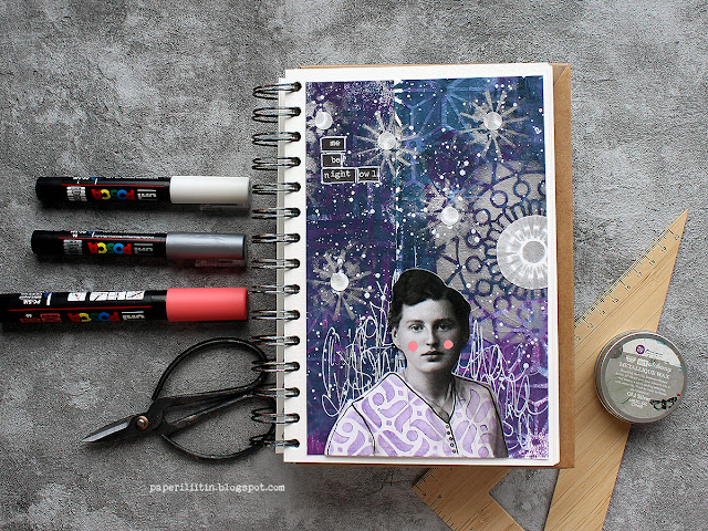
Why I’m bringing this up was that I didn’t want to repeat myself! Although there’s similar elements in my page now, there’s also something new, so I call that mission accomplished! Because like I say in the earlier post, I would love to be a night owl. In everyday life my current work and family life don’t allow me to follow my natural rhythm, but if I had the possibility I’d work until midnight and then sleep in. I seem to have a new productive sequence in between 9-11 pm!

I first tried to think what to do, but then gave in and just started doing, going with the flow. And I really like how the page turned out! I first colored two strips of paper using gel printing, then added patterns on top using stencils and lastly a flurry of stars and a moon. Why two strips of paper, you might ask. Well, they just happened to be there when I was reaching out to get a background piece. I thought it would be fun to start with those, to use “left-overs”. If you want to see, how the page came into being, please see the video below!
As you could see from the video, I used two Nathalie’s stencils in my make. Why I chose these two? Well, the reason for the ATC Mixup is kind of obvious, I think. It’s because of the multitude of patterns in one stencil! I didn’t have to settle to just one or two patterns but could use an abundance! And as you can move the stencil and continue the pattern, the smaller size doesn’t matter, either. I did want to add another stencil to the mix, to have a bigger pattern. For that I chose “Manhattan”. Its angular design complimented the curvier, softer patterns of the ATC Mixup nicely.
I went through several Tim Holtz paper dolls when searching for the right one. This lady had the right air about her, and she somehow reminded me about Edith Södergran, a Finnish poet. One of the first poems I read from her was titled “Stars”. But when I was checking the placement, her white shirt looked too pale, and it had such a big contrast between the inky blue background it was stealing the attention too much. Luckily, I had an easy solution! You could see that from the video, too, I just added a pattern on top. To keep the project cohesive color-wise, I used one of the colors I had used in the background as well. The patterning hid some of the details of the garment, so I then drew those in. You can probably see my hesitation in the video. I was afraid that the black Posca marker might be too much, but luckily it was just what the doctor ordered! Her hair balances the dark marks nicely.
Thank you for stopping by today! Wishing you a splendid weekend!

Materials:
StencilGirl Manhattan stencil
StencilGirl ATC Mixup Kalbach stencil
GelliArts 3x5" gel plate
PaperArtsy Fresco Finish acrylic paint Double Denim, Purple Wine, Midnight, Snowflake
Prima Marketing Metallique wax Old Silver
Posca PC-5M Coral pink
Posca PC-1M Black, Silver, White
Tim Holtz Idea-ology Chitchat stickers
Tim Holtz Idea-ology Portrait Paper Dolls
A small circle punch


No comments:
Post a Comment